Darren Sylvester: CARVE A FUTURE, DEVOUR EVERYTHING, BECOME SOMETHING

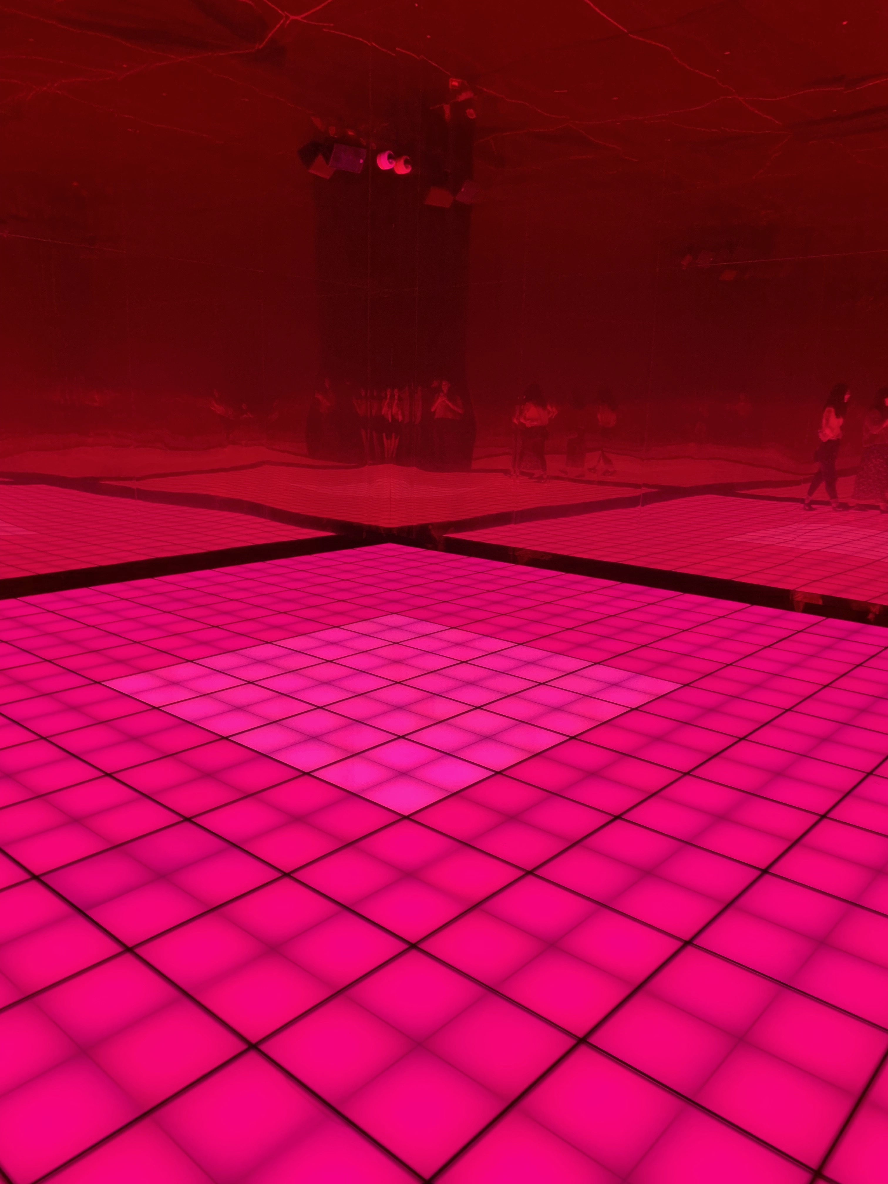
On Saturday I went to the NGV with the intention of visiting an exhibition about Aboriginal art. After going to that exhibition I was impressed by the artwork but wasn’t too engaged. Then, as I was about to leave the museum, I heard music. This instantly attracted my attention. From the moment I got near to the exhibition I was intrigued, I didn’t know what I was entering as there wasn’t much signage. As I walked closer the music got louder and louder, then I started to recognise some pictures that were displayed – it was an exhibition on Darren Sylvester. Before I had an in depth look at his artwork, I immediately went to what caught my attention initially – the music. In the exhibition area I entered through a white door where the music and some red lights were shining out of. I had entered a mirrored room with light up floors that reminded me of a retro disco floor. I didn’t entirely understand what I was looking at, but it was very intriguing, with the bright lights mesmerising, almost hypnotising my vision and those around me. Jake Barton, founder of Local Projects, highlights that people “want to express themselves and see their own identity refracted through the museum’s” (Barton, 2014) , implying that people want to engage with museum exhibitions in a way that can reflect who they are. This is very applicable in many of Sylvester’s museum exhibits. Sylvester focuses a lot of his artworks on attracting many different senses within viewers, rather than just the visual that is used in every piece of art. He breaks out of what the standard type of artwork is and attempts to delight the viewer in more different and engaging ways. In doing so, he “breaks down the fourth wall of design” (Solis, 2016) and partakes in something that Matthew Holt, Design Program Manager at the University of Sydney, refers to as Participatory Design. This refers to the collaboration of all people within the design process, not just the end user. In this case, the act of the viewer collaborates and partakes in the audio and visual aspects of the disco room, ultimately making them part of the exhibition itself. 

Furthermore, Carl DiSalvo’s writings ‘Design and the Construction of Publics’ explores how the public is influenced and affected by it’s own political state. He states that “the public is an entity brought into being through issues for the purpose of contending with these issues in their current state” (DiSalvo 2009, 49), highlighting the myriad of difficulties that arise within a contemporary society. This directly correlates with many of Sylvester’s artworks. In particular, his work titled ‘Broken model’. This photograph is a reenactment of a moment from Jean Paul Gaultier’s fashion show where a model had, initially unknown to Sylvester, fallen deliberately. His recreation to this enlightened viewers about “empathy, lack of authenticity and fashion desirability” (Sylvester). 
Overall, I really enjoyed this exhibition. The many different interactive and reflective ideas it portrayed really stood out to me. 

Bibliography

Jake Barton, An ingenious museum design that turns visitors into creators. Accessed April 10, 2019. https://www.wired.com/2014/06/a-design-museum-that-turns-its-visitors-into-designers/

Brian Solis, Break the fourth wall to transform customer experience. Accessed April 10, 2019. https://relate.zendesk.com/articles/breaking-fourth-wall-customer-experience/

Disalvo, Carl. 2009. Design and the Construction of Publics. Massachusetts: MIT

Sylvester, Darren. 2019. CARVE A FUTURE, DEVOUR EVERYTHING, BECOME SOMETHING. NGV

Forgotten Superheroes of Design

Student Name: Chen Xiaoyan

Student No: 27596907

An often-forgotten trend is an indigenous design in Australia. In the past, non-indigenous designers have been reluctant to acknowledge the value of the indigenous perspective. This is rooted in traditional design education, which only regards designs stemming from North America and Europe as artistic. The world of “manmade” design constituted as recovered history, not only places and marginalizes women, but also places all people in this position. Expect a few nations such as the intellectual culture of Eurocentric rationality has a history of domination.

Not many Australians know a single Aboriginal designer although most have “one in their wallet”. Aboriginal artist Malangi from the North Territory, whose bark painting was the most well-known painters from Arnhem Land. His work was reproduced and used in the Australia $1 note which is not acknowledged or honored.(Fig 1) The Australian Government decided to convert to decimal currency and asked seven designers to submit preliminary sketches. A suggestion that one note might embody an Aboriginal theme’ was one of the guidelines for the artists. Kupka share his travel photographs to those designers for inspiration, among them was Malangi’s painting. Gordon Andrews’s designs were selected which incorporated Malangi’s basic pattern.

Figure 1: Gorden Andrews, Australian one-dollar note, April 1964.

One of the teachers who had introduced Karel Kupka to Malangi, recognized myth design should be the Matangi ‘property’. To solve the copyright concerning the design, the Governor of the Reserve Bank made an arrangement for him to receive both a fee and some symbolic acknow- ledgement of his contribution to the design. Coombs’s explanation for this circumstance is that ” he and other bank officers, and presum- ably Gordon Andrews, had assumed ‘that the designs were the work of some traditional Aboriginal artist long dead’.

Malangi’s contribution to the dollar note depicts in part the mourning rites. The unjust treatment for design honor may due to racial discrimination by state and federal governments. In the 2002–03 National Aboriginal and Torres Strait Islander Social Survey, about 18% of the Indigenous adults felt treated badly in different fields because they were Aboriginal or Torres Strait Islander. Similar data shows in the 2001–02 Western Australian Aboriginal Child Health Survey.

This has begun to change as design education starts to normalize the indigenous perspective. Communication designer can help build cross-cultural understanding and break down barriers of ignorance within the wider community. Many designers fear of offending indigenous people due to the history of inapropriate representation and cooperation. The Australian Indigenous Design Charter protects the Indigenous designer by honor cultural internship and intellectual property right. Promoting a rational attitude, encourage designers to work on Indigenous projects only with well-prepared and respect appropriate practice.

Nowadays, we can embrace the indigenous perspective publicly. One example is the Aboriginal Flag (Fig 2) designed by Harold Thomas in 1971. The flag is divided horizontally into half. The top half is black represents the Aboriginal people of Australia, and the lower half red ochre used in ceremonies and Aboriginal peoples’ spiritual relation to the land. The connection between people and land is emphasized.  At the center of the flag is the yellow sun, which is the giver of life. An aboriginal community experienced forced a removal of their culture in the twentieth century, and people came to mourn their past and reinforce their identity through the use of fabrics.  Harold Bowen produced natural dye scarves made with silk and linen. There is a distinctive Australian feature to the design, showing the resilience of the aboriginal culture. The natural materials used connect fashion with indigenous communities.

Figure 2 : Harold Thomas, Australian Aboriginal Flag, 1971.

Australian Indigenous culture should not be underestimated. The beauty of handmade design steeped in experience. The Indigenous design represents complexity, celebrates memory and place. The Memory means that indigenous design exists since antiquity. Before the White people came to Australia, indigenous people designed artifacts. The ancient stories are passed down through design. Indigenous design showcases story, as well as the connections to country and place.

Bibliography

1. AUSTRALIAN INDIGENOUS DESIGN CHARTER – Communication Design. Protocols for sharing Indigenous knowledge in communication design practice.

2.  David H. Bennett, Malangi: The Man Who Was Forgotten Before He Was Remembered [online]. Aboriginal History, Vol. 4, 1980: 43-48.

3. Fry Tony, A Geography of Power: Design History and Marginality, Vol. 6, No. 1, Design in Asia and Australia (Autumn, 1989), pp. 15-30.

4.  Gallois, Mathieu. The ‘Aboriginal flag’ as art
. Australian Aboriginal Studies, No. 2, 2016: 46-60. Availability:<https://search.informit.com.au/documentSummary;dn=520864522777320;res=IELIND> ISSN: 0729-4352. [cited 09 Apr 19].

5. Kennedy, R. (20015). Designing with Indigenous Knowledge: Policy and protocols for respectful and authentic cross-cultural representation in communication design practice. Phd dissertation, Swinburne University.

Rosie Weiss: A Forgotten Hero

Scarlett Noorman 28780051

“With all the things that are going on environmentally, it’s just a reminder of what to fight for”

Rosie Weiss on her work, ‘On the edge’

In visiting ‘In the Valley’, the latest exhibition from the Mornington Peninsula Regional Gallery (as detailed in my last post), I found myself struck by the works of artist Rosie Weiss. Her works are rooted in and around the landscapes of the Mornington peninsula, where she lives and works. Consuming an entire wall of the exhibition was her piece, ‘On the Edge’.

‘On the Edge’

The artwork features hundreds of fragments of nature- branches, leaves, corals- collected from the “edges of human activity” over the span of the last 40 years (Mornington Peninsula Regional Gallery 2019). These fragments are delicately and carefully assembled, together they are reminiscent of either systems found in nature, like the vein patterns of leaves, or the human circulatory system, a large part of a tree acting as the heart. Contrastly, they could be viewed more as specimens, as pieces placed on the surface designed for human study. Either viewing of the of the work will stir emotions surrounding the beauty found in nature, and in considering the broader context of the exhibition, the potential destruction of our natural environment in the coming decades. The meticulously designed spacing between each remnant makes each appear quite lively, despite the fact that they were collected up to forty years ago. The impact that this work had on me when I first entered the room has lasted throughout the two weeks since I saw it, I am still bemused by Weiss’ ability to arrange so many small pieces to serve as an almost living, breathing, whole.

‘On the edge’

During my visit to the gallery, Weiss was present chatting to visitors, remarking in her works. She exclaimed at how she was delighted at visitor’s interaction and connection to the work. She noted that it brought her joy to see many people taking photos of it, which makes for a nice break from the typical ‘no photography allowed’ signs plastered around many galleries.

Her work signifies a need for social change, in a very gentle way. This is to say, in complete contrasts to past Australian artists such as the Inkahoots collective, who used overt slogans and mass outreach to promote change (Poyner 2013). Many believe that not enough societal action is being taken to halt climate change, hence the purpose of the ART + CLIMATE=CHANGE festival. In his writing, with regard to the lack of artist-turn activists working towards change, Paul Downton asks “Where are the images capable of really jolting our consciousness? Where is there any truly artful expression of what’s happening?” (2012). I believe that Weiss’ ability to reference the beauty and fragility of nature in her works is encouraging necessary societal change and has the ability to make people rethink their actions in regard to how we treat our land.

References

  • Wall text for ‘On the Edge’ by Rosie Weiss. ‘In the Valley’, Mornington Peninsula Regional Gallery, 2 March.- 5 May. 2019.
  • Downton, Paul. “The Art of Climate Change.” Artlink 32, no. 4 (2012): 18-21.

‘In the Valley’

Scarlett Noorman 28780051

In the seaside town of Mornington, about an hour south of Melbourne, recently I had the privilege of visiting the Mornington Peninsula Regional Gallery’s exhibition ‘In the valley’. The exhibition is part of the ART+CLIMATE=CHANGE 2019 festival, presented by CLIMARTE, featuring a list of 30 or so curated exhibitions across the state surrounding themes of environment, climate change, activism, community engagement and accelerated action (CLIMARTE 2019,1). In the valley aims to “highlight the beauty and fragility of our natural environment” (Mornington Peninsula Shire, 2019) in the local area. The Mornington Peninsula Regional Gallery is a small sized local gallery situated in a civic reserve alongside the Mornington Botanical Rose Garden, which, while objectively quite beautiful, the garden’s British-Colonial aesthetic provides a stark contrast to the contents of the exhibition inside.

In entering the first room in the gallery, there exists a striking collection of works by artist Siri Heyes. Heyes’ series of photos present beautifully crafted large scale prints of beach landscapes. Each photograph contains somewhere within an individual, reminding us that these vast landscapes, while once unadulterated, are now places at the disposal of mankind for the individual’s need; be it walking a group of dogs or scattering the ashes of a loved one. The standout work of Heyes’ is her video piece, ‘Harmonics for Western Port Dolphins’. The video features a woman facing towards a vast bay, playing a tender flute song that permeates the room; and haunts the air of the entire (otherwise close to silent) exhibition. I wonder if her song is her attempt to quell the environmental fears of the dolphins, or my own fears for the imminent destruction of our natural landscape.

Oil paintings by Jean Langley

Covering the far side of the room is a collection of oil paintings by Jean Langley, primarily of landscapes across more southern locations in the Mornington Peninsula. Somewhat akin to more traditional landscape paintings, these showcase the natural beauty and rolling hills of the less inhabited areas. However, like the landscapes themselves, her paintings are imperfect. They are extremely raw, you can visibly see her very freed brushstroke swipes and portions of unmixed paint. It takes a well-practiced artist to be able to make things look so unplanned.

‘Plastic Collected from Mt Martha Beach’ by Merryn Lloyd

Merryn Lloyd’s last three works in the room really struck me- her works now present a quite horrifying reality. The beautiful beaches and scapes I had just seen in Langley’s works are now presented as being places coated with- or should I say composed almost entirely of- fragments of plastic left behind by people. The self-evident title of the series (‘Plastic Collected from Mt Martha Beach’) clues us into the artist methods here. Will this provoke it’s viewers to become more environmentally conscious of how they dispose of their plastic waste?

Some plastic I found on the beach, originally believing it to be some kind of shell.

After the exhibition I decided to take a drive to see these cliffs in question as well as the former hotspot, the ‘Pillars’ (located behind the cliffs, famed as a locale for groups of teens to jump off into the water below). As I understood it, the Pillars were now closed to the public in the interest of public safety and environmental preservation. What I found was more than underwhelming. Large concrete barriers fencing off massive areas, signs threatening 24 hour CCTV surveillance and, unsurprisingly, a beach coated with it’s fair share of plastic rubbish.

Overall, I do believe that this is a purposeful exhibition. I can really appreciate how the curation of local artists’ works feeds into the broader idea of how we as a society treat our environment and why it is important to fight against climate change. This becomes a key motivator in some of the works from this exhibition, which I will de detailing in my next post.

REFERENCES

  • ART + CLIMATE = CHANGE 2019 Festival Booklet, CLIMARTE, 2019.
  • In The Valley: An MPRG Exhibition. Mornington Peninsula Shire, 2019.

Designing Women NGV International

Student Name: Chen Xiaoyan

Student No: 27596907

Designing Women presents in National Gallery Victoria of International important holdings of female designers as a dynamic and critical force in shaping contemporary design practice and culture.Men dominate the design industry due to the influence of patriarchal, while the exhibition reveals that female designers are recognized by producing sophisticated, iconic and thought-provoking work.  From1970s onwards, the percentage of female designer have comprised over 50 percent. The developments to be reflected in gender equality and feminism, while it is difficult to know the reality of the situation. 

With 60 pieces of work on show, the La La (Fig 1) lamp is one of the incredible works Which is designed by Helen Kundalini and manufactured by Kundalini in 2004. The lamp formed by duplicating the two cones shape such that lower cone acts as a reflector. The lamp is also a piece of decorative furniture, highly elegant floor lamp that can be placed anywhere around the home. There is an undeniable modernism design classic that radiates class to the La La Lamp. Traditional lamps are embellished with pattern or decoration and usually rounded. While the La La lamp has a smooth surface made from plastic and fabric, has no embellishment that diverts the attention of viewers.The flowing clean lines, pure and unfussy are the key components that capturing design philosophy – “less is more” by Mies Van Der Rohe. The lamp performs its basic functionality well, namely to illuminate the room with radiates warm and comfortable lighting. In addition, it adds sculptural beauty to the room.

Figures 1: Helen Kontouris designer/ Kundalini, Milan manufacturer, La La Lamp,2004;National Gallery Victoria of International

Other standouts include Lee Darroch, Yorta Yorta, Mutti Mutti, Boon Wurrung artist, has designed a 25 possum-skin cloaks (Fig 2). Four of them embarked upon a reproduction project as the originals are fragility in 1999. The incredible craftsmanship of her works is an important cultural value for south-eastern Aboriginal Community as a lack of information regarding the creation and commercial used of design practice.Few cloaks made by the Indigenous people in the nineteenth century have survived to the present day, around a hundred of cloaksheld in communities and used for welcome to country and important ceremonies.The cloaks made from a mass of sutured possum skins were protection against inclement weather. Burnedand painted with ochre on the cloak mapped the identity of the owner and their family, telling stories of clan and Country. In 2008, the government made an apology to Aboriginal for Colonisation and identified the determination for re-adjusting the Australian history and culture. Taking part in reproduction the Aboriginal cultural practice has a powerful therapeutic effect on many communities in south-east Australia.

Figures 2: Lee Darroc/ Yorta Yorta / Mutti Mutti / Boon Wurrung, Gumuka, baitja biganga (Old woman, old man possum skin cloak).

Design has been broken up into gender roles. Women are under-presented in product and furniture design and over-presented in fashion and jewellery. The value of female designers is being omission within a patriarchal society.The exhibition is meaningful andputting a spotlight on female artistsby crossing multi-disciplinary creative fields, and achievements of their design. Few women are included in the literature of design, their works either defined as feminine products or putting those design under the name of their family or husband. Designing Women is enhanced by the creativity and abundance of woman talent, from fashion design and contemporary jewellery to product design and architecture design. Women design is no longer considered to be naturally suited to certain areas of design production, namely, the so-called decorative arts.The exhibition reveals offer fresh perspectives and profession of female designers. 


References:

1. Cheryl Buckley, “Made in Patriarchy: Toward a Feminist Analysis of Women and Design”.

2. Helen Gibbins, “Possum Skins Cloaks: tradition, continuity and change”, from No.85 (May 2010) page 125.

3. Jane Connory, “Plotting the Historical Pipeline of Women in Graphic Design”.

4. LeAmon, Simon. “Designing Women”. National Gallery Victoria of International https://www.ngv.vic.gov.au/essay/designing-women/accessed 27 Sep 18.

5. Reynolds, Amanda Jane (ed.), 2005, Wrapped in a possum skin cloak, the Toolyn Koortakay Collection in the National Museum of Australia, National Museum of Australia. 

6. Russell Kennedy and Meghan Kelly, AUSTRALIAN INDIGEBOUS DESIGN CHARTER-Communication.


NGV: Designing Women

24th March 2019

Designed work by women, spanning from 1980-2018

It was a sunny Sunday morning as I made my way into the city, the drive-in was scenic and refreshing. I planned to meet Kelly at 11:30 am for our NGV outing. Since I was half an hour early, I made my way towards Lindt Café Southgate with my usual coffee order ‘a regular strong cappuccino, no sugar’. Feeling more energetic after my coffee fix, I walked along the Yarra towards the waterfall wall at the entrance and spotted Kelly. We picked up a brochure and made our way up in the different levels of the gallery in sequential order.

One hour in, and we’d finally reached the third level for contemporary art and design showcasing the ‘Designing Women’ exhibit. This exhibit highlights a collection of women designed work from around the world. As the issue has come to light that “Not enough women designers are given the recognition that they deserve,” [1] says graphic designer Antonio Carusone. Stating that “only a small fraction of active female designers receive public acclamation” [2].

The exhibit explores four themes; leadership, teamwork, research, and community. Ranging from fashion, product and furniture design in combination with architectural and textile pieces. It was a space bringing together multiple female designers from various disciplines into one location furthermore how their power of creativity has shaped modern design practice. Changes for “equal opportunity saw women respond positively to these competitive pressures” [3] to continue to challenge themselves and push creative boundaries in design.


My initial thought walking in the entrance was “wow, it’s like a colour spectrum in here, these designs are so vibrant”. The ambient lighting was ill-lit setting a confined atmosphere. But the light fixtures were thoughtfully placed in areas to highlight the objects on display to make them stand out. Even though the exhibition space wasn’t large, the artworks were spread out to make it less cluttered which also helped create a separation to avoid any confusion.

Designers included in the exhibition consisted of Zaha Hadid, Ann Robinson, Neri Oxman to name a few international designers. Featured works by Australian designers, such as Other Places by Elliat Rich and the collection of product and industrial design by Daniel Emma was interesting to me to learn more about local design also.

But the highlight for me would be the the La La Lamp by Helen Kontouris. The vibrant red is striking to the viewer’s eyes in combination with its unique form. The lamp is made of 2 conic shades constructed from opaline coated fabric. The design is also quite futuristic and reflects how contemporary art and design is intriguing, as the characteristics of the floor lamp is quite quirky, abstract, colourful and fun.

The main ideas centered around these design works was to present the contrast between past and present design. Elliat Rich stated, “You want to inspire people [to think], ‘The future is linked to now’,” [4]. This statement depicts how time and environmental factors have influenced a change in people’s thoughts and the future of design. But also, to educate aspiring designers.


“young female designers could greatly benefit from a change in the exposure and representation of women in graphic design” [5]

Brockett Horne, a designer and the Chair of Graphic Design at Maryland Institute College of Art

The range of over 60 expressive designs by over 50 designers that are also focused on how female designers have accomplished to produce pieces that are revolutionary, unique and iconic.


References
1. Hinn, T. (2019). Women in Graphic Design (and why we need to talk about them) | Desktop. [online] DesktopMag. Available at: https://desktopmag.com.au/features/women-in-graphic-design-and-why-we-need-to-talk-about-them/ [Accessed 6 Apr. 2019].

2. Hinn, T. (2019). Women in Graphic Design (and why we need to talk about them) | Desktop. [online] DesktopMag. Available at: https://desktopmag.com.au/features/women-in-graphic-design-and-why-we-need-to-talk-about-them/ [Accessed 6 Apr. 2019].

3. Connory, J. (2019). Plotting the Historical Pipeline of Women in Graphic Design. [online] DHARN. Available at: http://dharn.org.au/plotting-the-historical-pipeline-of-women-in-graphic-design/ [Accessed 7 Apr. 2019].

4. Grazia Australia. (2019). From the heart to the red centre, Elliat Rich’s designs are going places. [online] Available at: https://grazia.com.au/articles/elliat-rich-interview/ [Accessed 7 Apr. 2019].

5. Fussell, G. (2019). The Influence of Women on Graphic Design Over the Last 100 Years. [online] Design & Illustration Envato Tuts+. Available at: https://design.tutsplus.com/articles/the-influence-of-women-on-graphic-design-over-the-last-100-years–cms-30617 [Accessed 7 Apr. 2019].

Monica Yin

Shape, Pattern and Paper

Raphaela Alexopoulos

Often, traditional websites such as Pinterest and Instagram “keep us confined in the norms of modernism” with trends and update-to-date styles circling these sites. Being exposed to these sites it can sometimes be difficult to create something that is entirely yours, and inevitably, all work is inspired by another. We shouldn’t necessarily “mimic other designers” but rather create our “own design expressions”, whether that be through the style, materials, or methods you adopt; “merely imitating something that already exists gives the product less value” and creates something predictable and repetitive. (Christoforidou, Orlander, Warell 2012) I want to aim to do something different, to push the boundaries and source a variety of different materials to continually develop new way of producing and creating.

My design style has been developed through using materials and techniques that I enjoy and find interesting and engaging. I love using texture, pattern and paper collage throughout my work. Recently, I have been inspired by designer Tom Abbiss Smith who runs the Paper Plant studio in the UK. I love Smith’s used of pattern, his colour combinations and his use of abstract yet controlled shape. 

Similar to Smith, Owen Gildersleeve is UK based and uses paper cut-outs, vibrant colour and bold shape, but creates landscapes and typography that are often three-dimensional, have movement and are emotive. For the Sounding Type assignment in a second-year studio I used paper cut-outs to produce a fluid, abstract typeface. The design of the ‘Vallis Alps’ record and CD album sleeves I created were inspired by Gildersleeve’s paper cut-outs, in particular the one for the Time Out – Los Angeles cover titled Grand Canyons; I was inspired by his fluidity through the typeface, his use of movement and his use of colour. 

The initial work I was doing was using various mixed media, inspired by designers like Stefan Sagmeister and Alan Fletcher who used a lots of hands-on processes in their work. Then over time I started to find materials and techniques that I enjoyed working with and that gave me more flexibility than others.

Owen Gildersleeve

Before establishing the fluid typography for this assignment, I experimented with different shapes and colours, to ensure that the final product met the requirements of the brief and the intended ‘client’; through the process I learnt that the development process is almost as “crucial than its creation”. (Christoforidou, Orlander, Warell 2012)

Similarly, whilst developing a logo design in my identity class this year for a ‘granola mix company’, I’ve been using this idea of ‘controlled’ but fluid shape to create pattern. Although obviously not a direct mimic of Gildersleeve’s work, and also a digitalised image rather than a paper cutout, I feel as though my exposure to his work inspired me the most when developing this pattern.

I want my design style to reflect my interests and my personallydeveloped style; to be able to appreciate amazing work by amazingly talented designers, but not to conform to what is considered normal or ‘good’ on sites such as Pinterest. I want to put my spin on things, and to not be afraid to do that.

Using abstract shape and pattern to create an identity

References:

Christoforidou, D., Olander, E., and Warell, D. (2012) Good Taste vs. Good Design: A Tug of War in the Light of Bling. Lund University, Sweden. 

The Design Kids, Featured Creatives: Owen Gildersleeve, (2017). Accessed 9.4.19. https://thedesignkids.org/interviews/owen-gildersleeve

Old to New – Bark to Neon

Raphaela Alexopoulos

The Bark to Neon exhibition at the Ian Potter Centre: NGV Melbourne not only celebrates the works of Indigenous Australians, but also highlights the emergence and relationship new forms, materials and ways of expression can have with traditional forms and images. 

Walking into the gallery, the first work to grab my attention was the beautifully large “Anwerlarr anganenty (Big yam Dreaming)”, 1995 by Emily Kame Kngwarreye, measuring three by nine metres and undoubtedly one of the most notable pieces throughout the exhibition. Kngwarreye is one of the most well-known Indigenous contemporary artists, and through her work she is able to depict an “accurate and respectful representation of Australian Aboriginal culture”. (Kennedy & Kelly 2016)  From afar, I felt the works’ brilliantly abstract, loose, tangled and rhythmic line created a dreamlike feel; at a closer glance, though, the bold monochromatic colour palette creates a stark contrast and makes the rawness, irregularity and texture of the line more evident. I think this is a perfect example of the traditional raw, organic characteristics that is assumed to be so commonly associated with Indigenous art.

Anwerlarr anganenty (Big yam Dreaming), 1995, Emily Kame Kngwarreye

Similar to many other pieces throughout the exhibition the work reflects a connection to the land and exhibits these raw and organic attributes; this is paramount in so many Indigenous paintings and allows Indigenous artists to illustrate and express the importance of acknowledging the true owners of Australian land, especially when “colonial domination continues to be visible in our contemporary world”. (Onafuwa 2018) The work celebrates the growth of the native Indigenous vegetable – the anooralya (finger yam) – and the veins and contours of the earth beneath its growth. 

The exhibition highlights artists, such as Brook Andrews, who aim to repurpose traditional art into a contemporary context. Sexy and dangerous, is a computer-generated image that repositions an old photograph of an Aboriginal man from the Barron River in Queensland. Andrews layers Chinese characters and the words ‘sexy and dangerous’ over the Indigenous man, transforming the work into something that could be mistaken for a contemporary advertisement, despite there being no evidence of a product actually being sold. There is a sense of power and dominance in the reworked image, whilst still acknowledging the “history of brutality inflicted upon Aboriginal people in this country”. (Snell 2017)  

Continuing through the gallery, the inclusion of contemporary ways of expression becomes even more evident through the integration of brightly-coloured neon imagery. Reko Rennie is a contemporary artist that looks at Indigenous Australian identity through modern mediums; his neon pink installations, Regalia, caught my attention, juxtaposed against the natural, raw, traditional-looking bark installations positioned next to them and the dark gallery wall. Rennie “reminds us that Aboriginal people are the original sovereigns of this country” through using symbolism and engaging, contemporary ways of creating. (NGV Melbourne 2019) 

Reko Rennie, Regalia, 2013, opaque polymer resin and neon, NGV Melbourne.

Through attending the exhibition I learnt that Indigenous art is not limited to traditional ideas, dot art and paint; contemporary artists use their art to “defy preconceptions of what Indigenous art should look like and mean” and are able to create works that are symbolically and meaningfully Indigenous but conceptually modern and contemporary. (Onafuwa 2018)

References:

Kennedy, R., and Kelly, M. (2016). Australian Indigenous Design Charter – Communication Design. Australia, Melbourne: Deakin Univeristy.

Onafuwa, D,. (2018). Allies and Decoloniality: A Review of the Intersectional Perspectives on Design, Politics, and Power Symposium. 

Snell, T., (2017). Here’s looking at: Brook Andrew’s Sexy and dangerous. Accessed 9.4.19. https://theconversation.com/heres-looking-at-brook-andrews-sexy-and-dangerous-74076

NGV Melbourne, (2019). Regalia, Reko Rennie. Accessed 9.4.19.https://www.ngv.vic.gov.au/explore/collection/work/108708/

Forgotten Hero: Dorrit Dekk

Image result for dorrit dekk

There are many talented designers in history and in today’s time that have been overlooked and forgotten. One really amazing forgotten designer is Dorit Dekk. She was a Czech born British graphic designer “who helped to shape 20th century design in the UK” (Banks, 2017). As a child, she moved to Austria and later on fled Nazi rule during the Annexation of Austria. From there she went to study in London and during the war she worked in radio intelligence. By the end of the war she had joined the design studio of what was to become the UK government’s marketing agency. There she designed many famous and well known government posters which all led to Dekk working for different profound companies, including London Transport, Air France and Penguin.

Dekk designed many playful and bright posters and became a freelance designer where she became known as the ‘travel queen’. She continued to run her own design business and became a fellow of the Society of Industrial Artists. During this time, it was very uncommon for a woman to work in such a field, let alone have her own freelance business. Furthermore, “a woman’s dream was generally secretarial stuff or dress making” (Connery 2017), so it was incredible that a designer like Dorit made such an impact within the UK.

In Victor Margolin’s discussion piece ‘Design Studies: Tasks and Challenges’, he explains the differences and parallels between art and design. He states that, while art is “discursive” (Margolin 2013, 402) and “are not expected to produce a result” (Margolin 2013, 402), design “is … expected to achieve an outcome” (Margolin 2013, 402). Margolin highlights this difference which directly correlates with many of Dorrit’s works. For instance, her London Transport poster has a clear intended outcome of advertising and displaying the London underground in a positive way, revealing that any type of person, no matter their income, are ‘Londoners’ and can take the tube.

Image result for we are londoners dorrit dekk

Furthermore, Dekk was also known for her abstract use of collage in many of her works. The ‘Mobile Labour Force’ poster was designed for The Central Office of Information during the war. The outcome of this piece was to “raise the morale of the post-war labour force and present the essential rebuilding works as heroic” (Szulman, 2018), wherein the workers depicted are flying on a plank of wood. Here again, Dekk uses her design ability to achieve a specific outcome in a practical way.

Related image

Additionally, the reading ‘Women designers is there a gender trap?’ by Margaret Bruce and Jenny Lewis unpacks the idea of gender stereotypes within the working environment. During their writing, they delve into the ideas of “the sexual division of labor” (Bruce and Lewis 1990, 115) referring to “certain types of work … as being more appropriately carried out by one sex rather than the other” (Bruce and Lewis 1990, 115). Dekk was an inspiring designer as she not only went through many hardships throughout her life, but also became a very successful designer in a hyper-sexualised world.

Bibliography

Tom Banks. Discovering the forgotten female designers from history. Accessed April 9, 2019. https://www.designweek.co.uk/issues/23-29-october-2017/discovering-forgotten-female-designers-history/

Jane Connery. Plotting the Historical Pipeline of Women in Graphic Design. Accessed April 9, 2019. http://dharn.org.au/plotting-the-historical-pipeline-of-women-in-graphic-design/

Gabriella Szulman. ‘Designs on Britain’: focus on Dorrit Dekk. Accessed April 10, 2019. https://gabrielaszulman.com/2018/01/designs-on-britain-focus-on-dorrit-dekk/

Margolin, Victor. 2013. Design Studies: Tasks and Challenges. The Design Journal

Bruce, Margaret, and Jenny Lewis. 1990. Women designers is there a gender trap? Amsterdam: Elsevier Ltd

Colourful Mindset.

My own art practice.

View this post on Instagram

Colour publication for my ‘Nostalgia’ based project

A post shared by Annelise Turco (@annelisesartwork) on

My design practice involves me experimenting with vibrant colours, juxtaposing compositions and most importantly enjoying the process. Favouriting illustration as my best skill, I have selected a mix of work I feel best represents me as a designer. Firstly, I will refer to two publications I have created from 2018-19. My colour palettes always have a base of 5 colours, because I have so much fun with mixing and matching. Something I have become fond of in the last year is texture, and such artists are Louis Lockhart and Tess Smith Roberts have been major influences on me. Lockhart lives and works in an old cotton mill where she creates designs from paper cut outs and line drawings.Roberts is a London based illustrator and print maker. Both Lockhart (Paper Doll, Up My Street, Valentines Prints1and Roberts (Street Scene, Telegraph2)artworks ecomaps my favourite thing… Colour! And lots of it. Their attention to detail really strikes me as what I look for in my own art practice. I feel as though it is important for a designer to be one with their work, so personal touches are always really important. 

Jenny Lewis and Margaret Bruce reflected on something that connects really strongly with me “Because designers are inevitably subject to the ideas and influences of their social context, their designs must reflect their values.3” My value as a designer is to respect myself and the context which I depict. Gender equality and sexual status are things I strongly support, so wherever I can use my practice as a way to define that, I would consider successful. My illustrations tend to have people and figures as I love drawing people. Personalities and styles are great to work with, and I can accompany this with expression through colour. Victor Margolin states “Artworks, no matter what form they take, are primarily discursive.4” I love this idea, that being discursive means they can wander. They can be anything I want them to be, and so can the audience who look at it. Like Roberts and Lockhart, I put my work on platforms where I can be seen- a way to be totally free, with so many personalities appreciating my art. This year, I even began to apply my illustration style to handmade clay earrings, and really expressed how colour displays such strong energy when juxtaposed with one another.   

Much like the Earthworks Poster Collectives ideologies “From the mass media and the use of fluorescent poster inks these works adopt a DIY aesthetic5“, I try and replicate a screen-printed look with my artworks through layers of colours. While Roberts and Lockhart use pencil to achieve this effect, I use this as influence and replicate it through both pencil and vector-based images. The idea of the DIY aesthetic again relates back to how I believe it is important to be involved in the design and be recognised for a style on a page and therefore create influence as a designer.  

  1. Louise Lockhart, Paper Doll, Up My Street, Valentines Prints, 2019, Mixed media, accessed 9th April 2019, https://www.instagram.com/theprintedpeanut/
  2. Tess Smith Roberts, Street Scene, Telegraph Today, 2019, Mixed Media, accessed 10thApril 2019, https://www.instagram.com/tesssmithroberts/
  3. Bruce, Margaret and Lewis, Jenny. “Women Designers — Is There a Gender Trap?” Design Studies 11, no. 2 (1990): 120.
  4. Margolin, Victor. Design Studies: Tasks and Challenges. The Design Journal: Parallels between art and design, 16, no. 4 (2013): 402.
  5. Berry, Jess. “Earthworks and Beyond.” Alternative Practices in Design: Queensland collectives 1979-1989: Symposium Proceedings 2010, 2010,190.