Shape, Pattern and Paper

Raphaela Alexopoulos

Often, traditional websites such as Pinterest and Instagram “keep us confined in the norms of modernism” with trends and update-to-date styles circling these sites. Being exposed to these sites it can sometimes be difficult to create something that is entirely yours, and inevitably, all work is inspired by another. We shouldn’t necessarily “mimic other designers” but rather create our “own design expressions”, whether that be through the style, materials, or methods you adopt; “merely imitating something that already exists gives the product less value” and creates something predictable and repetitive. (Christoforidou, Orlander, Warell 2012) I want to aim to do something different, to push the boundaries and source a variety of different materials to continually develop new way of producing and creating.

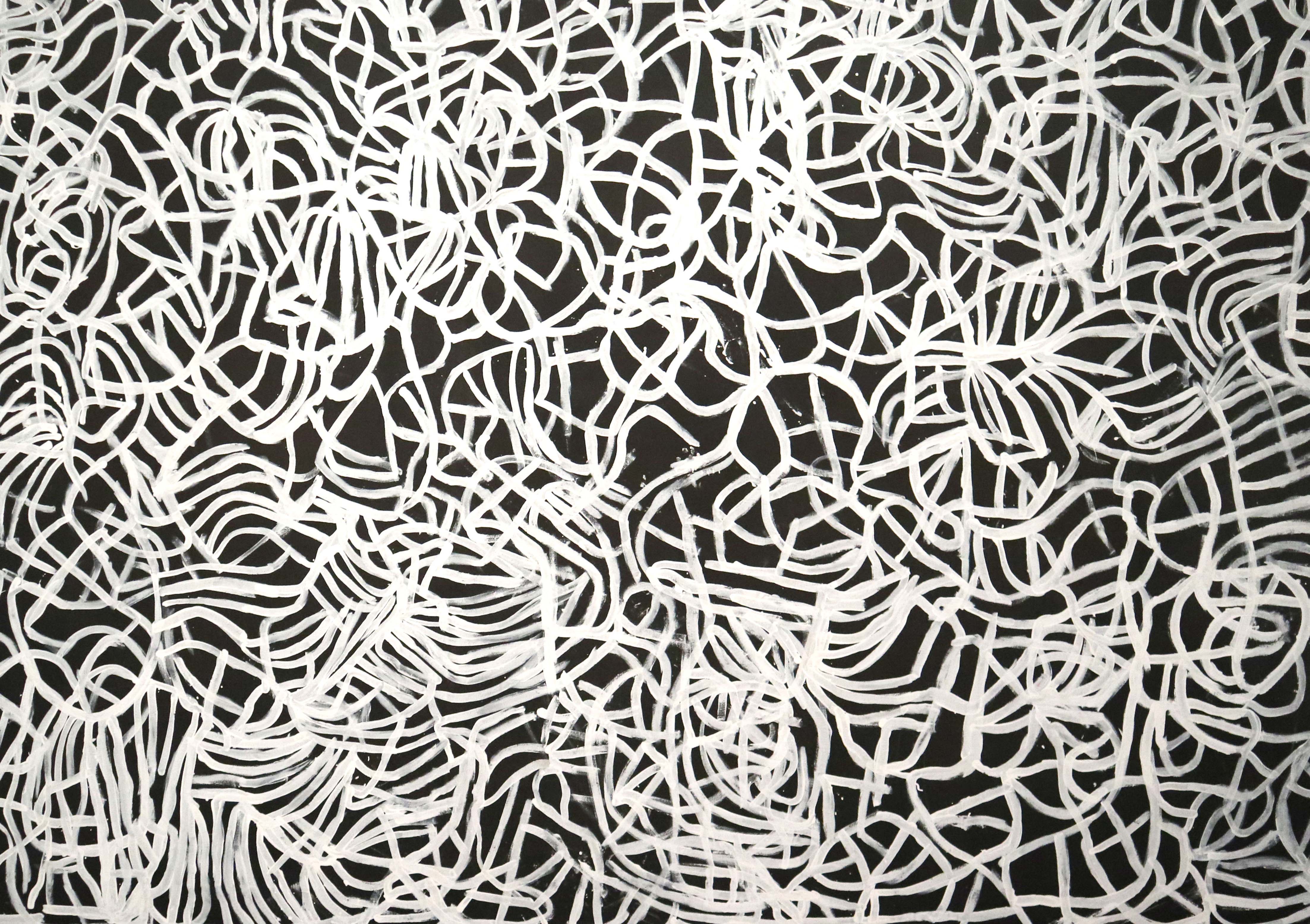
My design style has been developed through using materials and techniques that I enjoy and find interesting and engaging. I love using texture, pattern and paper collage throughout my work. Recently, I have been inspired by designer Tom Abbiss Smith who runs the Paper Plant studio in the UK. I love Smith’s used of pattern, his colour combinations and his use of abstract yet controlled shape. 

Similar to Smith, Owen Gildersleeve is UK based and uses paper cut-outs, vibrant colour and bold shape, but creates landscapes and typography that are often three-dimensional, have movement and are emotive. For the Sounding Type assignment in a second-year studio I used paper cut-outs to produce a fluid, abstract typeface. The design of the ‘Vallis Alps’ record and CD album sleeves I created were inspired by Gildersleeve’s paper cut-outs, in particular the one for the Time Out – Los Angeles cover titled Grand Canyons; I was inspired by his fluidity through the typeface, his use of movement and his use of colour. 

The initial work I was doing was using various mixed media, inspired by designers like Stefan Sagmeister and Alan Fletcher who used a lots of hands-on processes in their work. Then over time I started to find materials and techniques that I enjoyed working with and that gave me more flexibility than others.

Owen Gildersleeve

Before establishing the fluid typography for this assignment, I experimented with different shapes and colours, to ensure that the final product met the requirements of the brief and the intended ‘client’; through the process I learnt that the development process is almost as “crucial than its creation”. (Christoforidou, Orlander, Warell 2012)

Similarly, whilst developing a logo design in my identity class this year for a ‘granola mix company’, I’ve been using this idea of ‘controlled’ but fluid shape to create pattern. Although obviously not a direct mimic of Gildersleeve’s work, and also a digitalised image rather than a paper cutout, I feel as though my exposure to his work inspired me the most when developing this pattern.

I want my design style to reflect my interests and my personallydeveloped style; to be able to appreciate amazing work by amazingly talented designers, but not to conform to what is considered normal or ‘good’ on sites such as Pinterest. I want to put my spin on things, and to not be afraid to do that.

Using abstract shape and pattern to create an identity

References:

Christoforidou, D., Olander, E., and Warell, D. (2012) Good Taste vs. Good Design: A Tug of War in the Light of Bling. Lund University, Sweden. 

The Design Kids, Featured Creatives: Owen Gildersleeve, (2017). Accessed 9.4.19. https://thedesignkids.org/interviews/owen-gildersleeve

Old to New – Bark to Neon

Raphaela Alexopoulos

The Bark to Neon exhibition at the Ian Potter Centre: NGV Melbourne not only celebrates the works of Indigenous Australians, but also highlights the emergence and relationship new forms, materials and ways of expression can have with traditional forms and images. 

Walking into the gallery, the first work to grab my attention was the beautifully large “Anwerlarr anganenty (Big yam Dreaming)”, 1995 by Emily Kame Kngwarreye, measuring three by nine metres and undoubtedly one of the most notable pieces throughout the exhibition. Kngwarreye is one of the most well-known Indigenous contemporary artists, and through her work she is able to depict an “accurate and respectful representation of Australian Aboriginal culture”. (Kennedy & Kelly 2016)  From afar, I felt the works’ brilliantly abstract, loose, tangled and rhythmic line created a dreamlike feel; at a closer glance, though, the bold monochromatic colour palette creates a stark contrast and makes the rawness, irregularity and texture of the line more evident. I think this is a perfect example of the traditional raw, organic characteristics that is assumed to be so commonly associated with Indigenous art.

Anwerlarr anganenty (Big yam Dreaming), 1995, Emily Kame Kngwarreye

Similar to many other pieces throughout the exhibition the work reflects a connection to the land and exhibits these raw and organic attributes; this is paramount in so many Indigenous paintings and allows Indigenous artists to illustrate and express the importance of acknowledging the true owners of Australian land, especially when “colonial domination continues to be visible in our contemporary world”. (Onafuwa 2018) The work celebrates the growth of the native Indigenous vegetable – the anooralya (finger yam) – and the veins and contours of the earth beneath its growth. 

The exhibition highlights artists, such as Brook Andrews, who aim to repurpose traditional art into a contemporary context. Sexy and dangerous, is a computer-generated image that repositions an old photograph of an Aboriginal man from the Barron River in Queensland. Andrews layers Chinese characters and the words ‘sexy and dangerous’ over the Indigenous man, transforming the work into something that could be mistaken for a contemporary advertisement, despite there being no evidence of a product actually being sold. There is a sense of power and dominance in the reworked image, whilst still acknowledging the “history of brutality inflicted upon Aboriginal people in this country”. (Snell 2017)  

Continuing through the gallery, the inclusion of contemporary ways of expression becomes even more evident through the integration of brightly-coloured neon imagery. Reko Rennie is a contemporary artist that looks at Indigenous Australian identity through modern mediums; his neon pink installations, Regalia, caught my attention, juxtaposed against the natural, raw, traditional-looking bark installations positioned next to them and the dark gallery wall. Rennie “reminds us that Aboriginal people are the original sovereigns of this country” through using symbolism and engaging, contemporary ways of creating. (NGV Melbourne 2019) 

Reko Rennie, Regalia, 2013, opaque polymer resin and neon, NGV Melbourne.

Through attending the exhibition I learnt that Indigenous art is not limited to traditional ideas, dot art and paint; contemporary artists use their art to “defy preconceptions of what Indigenous art should look like and mean” and are able to create works that are symbolically and meaningfully Indigenous but conceptually modern and contemporary. (Onafuwa 2018)

References:

Kennedy, R., and Kelly, M. (2016). Australian Indigenous Design Charter – Communication Design. Australia, Melbourne: Deakin Univeristy.

Onafuwa, D,. (2018). Allies and Decoloniality: A Review of the Intersectional Perspectives on Design, Politics, and Power Symposium. 

Snell, T., (2017). Here’s looking at: Brook Andrew’s Sexy and dangerous. Accessed 9.4.19. https://theconversation.com/heres-looking-at-brook-andrews-sexy-and-dangerous-74076

NGV Melbourne, (2019). Regalia, Reko Rennie. Accessed 9.4.19.https://www.ngv.vic.gov.au/explore/collection/work/108708/