Bark to Neon: Indigenous Art from the NGV Collection

By Renee Sachi Bertol Yu

We are starting to see more and more Indigenous Art and Design appropriated into our everyday lives. In the National Gallery of Victoria until the 14th of July is the “From Bark to Neon: Indigenous Art from the NGV Collection” which features artists such as Paddy Compass Namadbara, Clifford Possum Tjapaltjarri, Rover Thomas, Trevor Nickolls, Lin Onus, Emily Kam Kngwarray, Sally Gabori, Brook Andrew and Destiny Deacon who have have shaped and transformed the face of Indigenous art in Australia and inspired many artists to follow in their example.T

Today I had the pleasure of visiting the exhibition and I can easily say that it has very much exceeded my expectations. It was a rather quiet afternoon and there were only about six to nine people in the exhibition while I was there. 

Looking in from outside you could see little bits of warm pink light filling the atmosphere, perhaps from the neon pieces, and it definitely set a very modern and almost romantic atmosphere. Upon entering, I immediately took notice of all the bold and vibrant colours around me.

Smile, 2017, by Destiny Deacon

Smile, 2017, by Destiny Deacon was one of the first few pieces that caught my attention as it’s not like most other indigenous art pieces I have seen in the past in a sense that it makes use of a bright yellow colour and also photography as its chosen medium rather than traditionally used colours and mediums.

Anwerlarr anganenty (Big yam Dreaming), 1995, by Emily Kame Kngwarreye

Then, Anwerlarr anganenty (Big yam Dreaming), 1995, by Emily Kame Kngwarreye filled my eyes as I approach the massive 291.1 x 801.8 cm painting. These art works definitely had me curious about what was ahead.

Regalia, 2013, by Reko Rennie

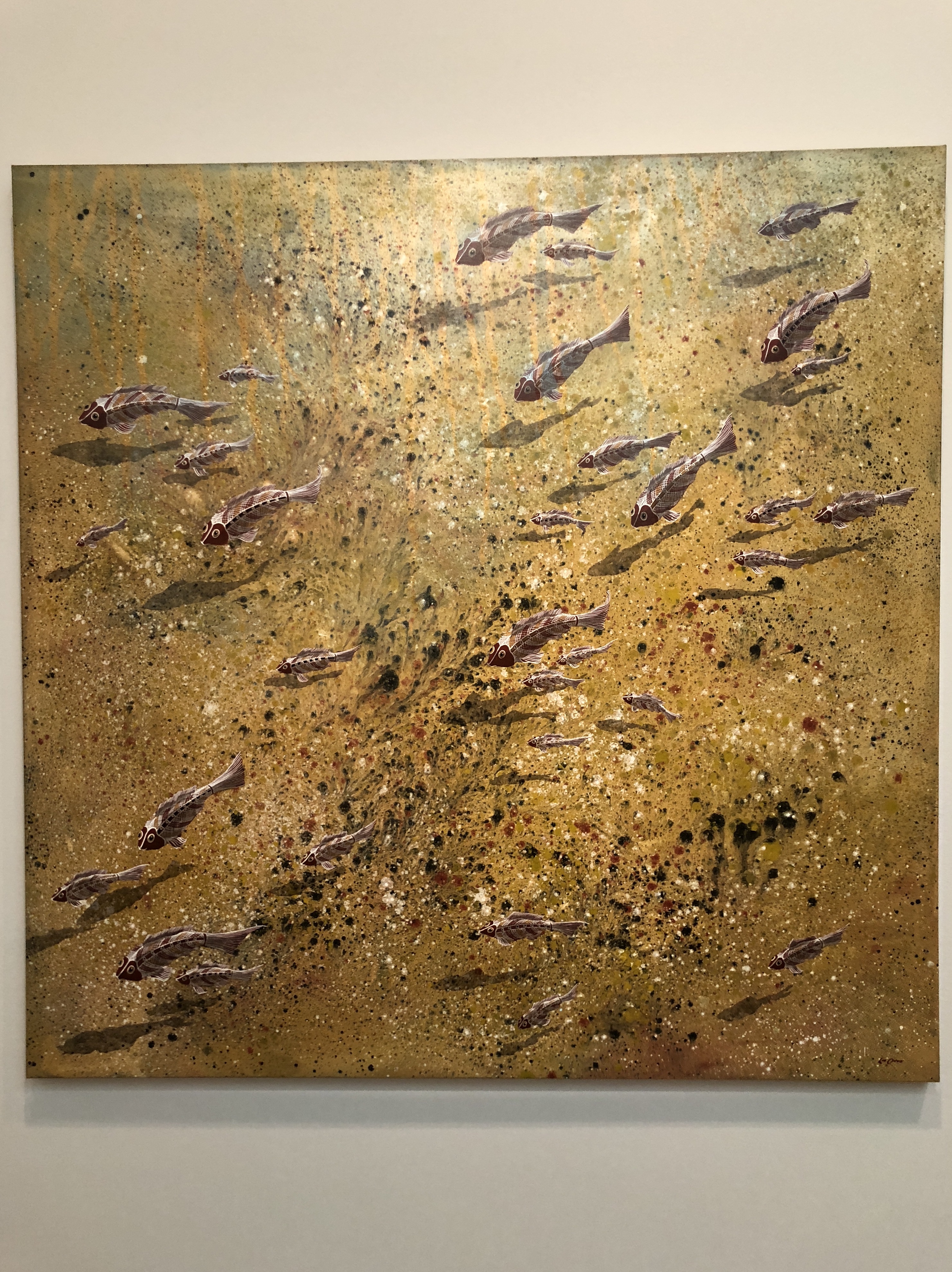
I entered a dark little corner, lit up by bright neon pieces like Regalia, 2013, by Reko Rennie. Next to these pieces seemed like more tradition pieces of art and it was rather interesting to see them side by side as they were both so different yet they share the same culture and perhaps some similar ideas.

Big Pintupi Dreaming ceremony, 1972, by Anatjari Tjakamarra

As I continued through the exhibition more familiar and traditional pieces made from acrylic paint dotting on canvas were presented such as the Big Pintupi Dreaming ceremony, 1972, by Anatjari Tjakamarra.

When I think of indigenous art, earthy, warm, and neutral colours accompanied by abstract patterns with organic forms usually come to mind, however this exhibition definitely took me by surprise it believe that it has done a great job of incorporating both modern and traditional art. I understand that discussing aboriginals in Australia is still a rather sensitive topic however as I learn more about them especially with the help of art, It has made me more eager to learn and potentially understand their culture and as someone who practices design, contemporary indigenous artist have definitely inspired me to be more bold and expressive with my work. I hope to see more exhibitions like this in the near future. I definitely recommend going to see Bark to Neon at the NGV while you still can!

Reference and Image Sources:

NGV Melbourne, (2019)
https://www.ngv.vic.gov.au/exhibition/from-bark-to-neon/

Forgotten superheroes of design

Forgotten superheroes of design: Denise Gonzales Crisp

The discrepancy is existing in between female and male designers in the industry. Denise Gonzales Crisp, Chair of Graphic Design at the College of Design, North Carolina State University, shared “salary discrepancy between males and females in education. Almost every institution I’ve looked at, the women earned on average anywhere from $5,000 to $10,000 less in the same positions.”1 Although women contributed in the industry in various fields, such as graphic, fashion to industrial, they still not getting what they should have paid, not only about salary but fame as well.

Denise Gonzales Crisp at the Typo San Francisco conference in 2014.

Denise Gonzales Crisp, a professor of Grapher Design and Director of Graduate Programs for Graphic Design, was prior to arriving at the college in Fall 2002, she was a senior designer for Art Centre College of Design in Pasadena, CA, and principal of the studio SuperStove! designing projects such as Artext magazine, Southern California Institute of Architecture lecture series, and books for independent presses.

Gonzales Crisp’s designs and writings have been published internationally, some of her works were featured in the 2002 exhibition East Coast/West Coast Dreams, Paris, in the 2005 anthology All Access: The Making of Thirty Extraordinary Graphic Designers, and the 2009 exhibition Dimension Typography, Chicago. Besides designing, she has lectured widely as well as a featured speaker in many design schools such as RMIT in Melbourne.

“Trans.” Calgary, Alberta, Canada, 2005

Gonzales Crisp discovered her interested in hand-drawn letterforms, clip art and ancient calligraphic lettering through the early 1990s. Which has been reflected on her later work. Gonzales Crisp designed a poster ‘trans’ for a Canadian arts festival, there is when she starts to fall with letters with her illustrator background. She thinks that the ‘fancy lettering’ and painted signs are mixing together perfectly. As Gonzales Crisp is calling this kind of design as ‘Decoration’ which involves research and writing as well as practice, she has been working on this for the past few years. Gonzales Crisp engaged Modernism and functionalism in her works, and suggested that ‘function is competed by ornament’.2

Gonzales Crisp says that ‘The decorative is clearly undervalued, and not just canonically but culturally too.’ 3 The term ‘decorator is often used in a pejorative way today. As a fan of ‘decoration’, she started to think what makes something ‘decoration’- rather than, say, merely decorative. According to her, ‘The rational aspect of the decoration is its capacity to tell, not only in a story-like way, but also in a metonymic way in the same way that icons do,’4 she noticed the complexity in designs.

Image by Denise Gonzales Crisp

Not only the complexity in ‘decorative’ has been noticed by Gonzales Crisp, she also found out the complexity between gender in design, “Right now, my classroom is probably filled with 80% women. And yet when I go out into the world, or when you hear from business owners or from creative directors, it’s not the same percentage. What is that, why is that? We can only guess.”5 As playing different roles in the design industry, Gonzales Crisp may has the impact to change the situation.

Bibliography

  1. Tori Hinn, Women in Graphic Design (and why we need to talk about them), 2014.
  2. Alice Twemlow, Denise Gonzales Crisp: The decorational, 2005.
  3. Ibid.
  4. Ibid.
  5. Tori Hinn, Women in Graphic Design (and why we need to talk about them), 2014.

Yu Chuang 27688550

The Art of Taboo

In answering this question, the ‘Forgotten superheroes of design’ I chose was a Chinese photographer. His name is Hang Ren. Before answering the specific content of the question, I will first explain why the photographer is forgotten. First of all, Hang Ren’s “forgotten” can be understood as a manifestation of marginality, which is derived from reading materials in reading. For the understanding of marginality, the general explanation is at the edge of the political or economic power center (Fry, 1989). If this concept is used to describe Hang Ren, I think there are two main reasons. On the one hand, as an artist and photographer, Hang Ren’s work can’t always be accepted and appreciated by the mainstream and the public. On the other hand, Hang Ren’s character is also solitary, which makes him always on the verge of interpersonal communication. It is precisely because of the mutual influence of these two reasons that he has the label of “forgotten”.

During process of photography, Hang Ren gradually formed a photography style that only belongs to him. After observing and admiring these works, it is not difficult to find that although these pictures are mostly glamorous in color, it is still difficult to cover up the gloomy atmosphere revealed. Many professionals believe that the intention of Ren Hang’s work is to make everyone who watches his work aware of the existence of such a group of people in China. To achieve this theme, his works often depict strange, abstract images such as bare, stacked, entangled, distorted bodies, bizarre costumes, exaggerated poses, and indifferent expressions (Holt, 2015). Hang Ren uses these body language to form what he wants to say to everyone in the community.

https://web.archive.org/web/20170228114320/http://www.renhang.org/Photography-2013

If we analyze these works from a detailed perspective, we can find that most of Hang Ren’s photographs are marginalized in the society, and most of the expressions he presents in the photos are posing. However, this style of photography always flows in the concepts of rigorous, funny, and documentary (Engholm and Salamon, 2017). It is difficult for us to summarize a specific category for his photographs. In Hang Ren’s work, the use of light is always very obvious. Anyone who likes his work will feel that the theme of Hang Ren’s work may be darker, but the attitude must be positive. We use his work to make specific explanations. In his photographs, the characters he photographed are often naked. However, it is more noticeable that the eyes of the characters are indeed. It is difficult for us to use a certain word or sentence to describe the meaning revealed in the eyes. However, this is in stark contrast to the bright light in the background (Christoforidou et. al, 2012). In the face of such a photographic work, the audience seems to be able to find a glimmer of hope in the feeling of uneasiness. This is what many people think is the value of Hang Ren’s work.

Many people think that Hang Ren’s work is not good at the technical level, because Hang Ren is more willing to use cheap equipment to complete his work. However, he did complete his own collection and exhibition under such conditions. In his exhibition, Hang Ren pays more attention to linking the theme and meaning of the exhibition with the content of the exhibition. Therefore, I believe that such an inspirational and meaning-oriented photographer is the artist who combines life and art.

Bibliography

Christoforidou, D. et al. (2012) Good Taste vs. Good Design: A Tug of War in the Light of Bling, The Design Journal, 15, pp. 185-202.

Engholm, I and Salamon, K, L. (2017) Design thinking between rationalism and romanticism-a historical overview of competing visions, Artifact, 4, pp. 1-18.

Fry, T. (1989) A Geography of Power: Design History and Marginality, Design Issues, 6, pp. 15-30.

Holt, M. (2015) Transformation of the Aesthetic: Art as Participatory Design, Design and Culture, 7, pp. 143-165.

Designing Women @NGV

Designed work by women, spanning in the years 1980 to 2018

3 o’clock is always the perfect time to visit the National Gallery Victoria since everybody else is leaving and you’ll have enough time to read the works. I verified my theory by entering the third floor, there are sparse people, one guard, fragmentary footstep sounds, no sounds from people. This peaceful and serenity vibe is finishing my tranquility touring.

First stepped into the exhibit, the simple mix of colors, black and white in the room are drawing people’s eyes focus on the design works. In addition, the lowkey lighting inside the room and the lights that are emphasising on the works draws my attention. What first attracted me in the exhibition was the statement printed on the wall, “Designing Women shares that female designers, often overlooked in a male dominated industry, are producing sophisticated, iconic, and thought provoking work of exceptional quality.”1 This statement made me rethink about a couple of questions through the exhibition. First, why is there an exhibition especially hold for women, a specific gender. Second, what lead the industry into a man dominated condition. Last but not least, in which situation that people have to emphasis women can make professional works as same as man. The exhibit highlights the active and significance female designers and their works in contemporary design practice and culture, which focusing on four key narratives, leadership, community, teamwork and research.2

“The design industry itself, then, perpetuates the passive female stereotypes–women designers do sedentary work on textiles, fashion and ‘pretty pictures’”3 as we could see, instead of limited in these areas of design, industrial like furniture and installation art have been presented in this exhibit. Excluding the the lighting which emphasising the works, the works themselves are very enthusiastic, filled with different colors. The giant work ‘bloom’ was sitting at the very back in the exhibit and waiting to amazed people who walked pass. This huge work was designed by Alisa Andrasek and Jose Sanchez from Bloom Games, London. The work is made with plastic, which is an ‘unusual’ material that a female designer would used. The pink/ purple color of the work is standing out from the black of the room, it just popped into the viewer’s eyes in a sudden, brings out the sense of fun. The dynamic and fluid movement gave the final heart strike as a perfect ending to the viewers just when they thought they are finishing the exhibit.

The range of the presented works are various, they worked in the industry from past to present,  “changes in women’s education, work opportunities, gender attitudes and a government rhetoric of equal opportunity saw women respond positively to these competitive pressures.”4 all these marvellous works are competing with other female designers and the designers from internationals, different ages and gender. But also the female designers themselves, how they break through the boundaries indesign, and create their own characteristic, to be sophisticated, iconic and thought-provoking.

Bibliography

1. Designing Women, NGV.
2. Ibid.
3. Margaret Bruce, Jenny Lewis, “Women designers—is there a gender trap?”, 1990.
4. Jenny Connory, Plotting the Historical Pipeline of Women in Graphic Design, 2017.
5. Designing Women, NGV.

Yu Chuang 27688550

To Be Heard

By Joshua Fong

As a designer, I am constantly looking for new ways to incorporate my own sense of identity into my work. Currently, I have experimented with a broad range of different methods, including digital 2d prints, animations, illustrations and even a bit of physical print making. It is evident that there was a time where I was unsure of my identity, not just as a designer, but as a person, which reflected in the way in which I produced work. The passion and the expression of projects I’d completed had been stunted by a severe lack of certainty in myself. I have since overcome my troubles, and have found a renewed perspective on my outlook of life and my work as well. 

Melbourne Writers Festival Poster – Joshua Fong – 2018

I have decided to focus on abstract design, things that are reminiscent of experiences crucial to my identity, whether they revolve around my hobbies or my culture. In doing so, the work I produce may have a dual meaning, one may be that a project revolves around plants, but at heart the production of it is the animation or the foliage in the design. This no doubt pushes me to create work beyond my comfort zone and promotes the exploration of different materials, methods and media. It is further noticeable that as a designer, I have taken little to no inspiration from others in the same field, which has its own drawbacks and positives. A significant negative of this is that there is a lack of inspiration in learning different skills and techniques that other designers have accumulated. On another note however, the positives of this lack of exposure has allowed myself to innovate with a sense of originality and personalisation. 

In comparison to this, I draw upon a specific reference to the Earthworks poster collective. During the 1970’s many aspiring designers sought to create their own personalised works. Through means of technical experimentation, the artists and designers would operate the way in which they saw fit, resulting in an influx of political and philosophical promotions (Berry, 2010). Operating from under a tin shed, the freedom in which they sought to express their ideals and beliefs resonates with how the design industry may be seen today. All designers seek to project their interpretations of different aspects of life, with many producing bold works that may be radical or anti-society. Like the Australian members of Earthworks, many of us have become emboldened to create that which challenges the preconceptions of societal standards. It is notable that many posters from the Earthworks Poster collective embodied political views such as the denouncement of nuclear power or the promotion of rights for Indigenous Australians (Earthworks, 1979)

I am no exception to the example laid out by designers that have come before. This is seen through designer Stefan Sagmeister, who gained notoriety during the 90s through acts of self-harm in the name of design, challenging viewers to revaluate whether the mind can be trained to be happy (Mcdonald, 2012). Other works of his include Though the method of design is different, the principle will remain the same. A comparison between all designers would yield the fact that we are all striving to create something that voices our own opinions and sense of self. In comparison, my work is comprised mainly of graphics and illustrations, littered with only a few animations. However, Sagmeister’s portfolio, though comprised of graphics, illustrations and animations seems to expand further into different methods. This not only emphasises the skill and techniques that Sagmeister has accumulated over the years as a designer, but also highlights his drive to experiment with different methods. It is evident that this reinforces my belief that design is limitless in its creativity, and there is still much to learn. 

References

Berry, Jess. “Earthworks and Beyond.” Alternative Practices in Design: The Collective-Past, Present & Future: Symposium Proceedings 2010. RMIT University. Design Research Institute, 2010.

Museum of Applied Arts & Sciences. “Poster, ‘Dance Black Lace’, printed by Earthworks Poster Collective”. Museum of Applied Arts & Sciences, Australia. Retrieved 4 November 2017. Created 1972-1979.

Stephanie McDonald, IN PROFILE: Stefan Sagmeister explores happiness through design, 2012

Women significance in design

A forgotten hero: Jacqueline Casey

Women weren’t always acknowledged in the public eye. They were “treated as the inferior, minority sex” [1], and were constantly overshadowed by men in the creative discipline of design. Women over all creative fields have contributed a vast amount of iconic designs over the years ranging from graphic, product, industrial and architectural design just to name a few. However, they have not been recognised for their designs even though they’re just as capable and proficient as men.


Jacqueline Casey (1927 – 1992)

The designer I’ve chosen to focus on is Jacqueline Casey, a graphic designer born in 1927, Massachusetts. She was a 1949 graduate from Massachusetts College of Art, which is now known as Massachusetts College of Art and Design. After she graduated, she struggled to obtain a job in the creative field, so she works as a cashier to make ends meet financially. She persisted and worked hard to develop her own technique and style.

Retrieved from: http://www.grafiktrafik.com/jacqueline-caseys-swiss-style-posters/

Retrieved from: http://www.grafiktrafik.com/jacqueline-caseys-swiss-style-posters/

in time, Casey was later employed by Muriel Cooper, an alumna at MIT (Massachusetts Institute of Technology). She was enlisted to design a collection of posters. This collection ended up being one of her most iconic designs. “Casey’s posters generally consisted of a striking image or bold typography, accompanied by informational details in small text” [2]. Her methods in design has been influenced by the Swiss movement by using san-serif typefaces, a grid template to enhance simplicity and readability. “Casey’s work acknowledges the influence of the Grid established by the post-war graphic design masters in Switzerland” [3] such as Josef Müller-Brockmann and Armin Hofman who were the iconic designers during the 20th century.   

Retrieved from: http://www.grafiktrafik.com/jacqueline-caseys-swiss-style-posters/

Comparing Casey’s posters to the posters produced by Earthworks, they share similar characteristics. With further analysis, they both utilize the asymmetric layout in combination with bold san-serif type and vivid colours. Both using a similar technique, of grasping the viewers’ attention by implementing a hierarchical structure. “Earthworks poster collective as a group [that] created iconic images” [4] which was enlarged central image as the central focus spanning across the entire poster. Over the image, supporting text surrounds the outskirts of the poster to entice the viewers to delve deeper once they’re hooked in.  This same strategy was also Casey’s methods to designing posters too.

Retrieved from: https://maas.museum/

Casey’s posters were acknowledged in the design community for her science and technology poster designs. She was skilled in her ability to effectively communicate information in a interesting and creative manner. Casey always considered how the audience would view her work and succeeded in making them think about the ‘deeper meaning’ in a flowing pattern. Her legacy in art and design will continue to inspire young designers who aspire to reach their goals. As we can all relate to her struggles as a graduate, in the tough industry of design but she will also continue to impact the future of design practice.

References

1. History Of Graphic Design. (2019). 07. Jacqueline S. Casey. [online] Available at: https://edpacheco16.wordpress.com/jacqueline-s-casey/ [Accessed 10 Apr. 2019].

2. History Of Graphic Design. (2019). 07. Jacqueline S. Casey. [online] Available at: https://edpacheco16.wordpress.com/jacqueline-s-casey/ [Accessed 10 Apr. 2019].

3. Flask, D. (2019). Swiss Design : Design Is History. [online] Designishistory.com. Available at: http://www.designishistory.com/home/swiss/ [Accessed 11 Apr. 2019].

4. Berry, J. (2009). Earthworks and Beyond. Personal communications.

Monica Yin

From Bark to Neon: Glowing with Success

by Joshua Fong

‘From Bark to Neon’, which is currently exhibiting at the NGV portion of the Ian Potter Museum, is an exemplary display of indigenous Australian culture and how it has transitioned into the modern day. Contributed largely by Deakin University, the collection of works was composed to inspire young artists and to insight people to appreciate the diversity of aboriginal works. Glad to say that this was seen through the techniques and processes that I witnessed during my visit, which seemed to emphasise the process of generations of culture converging into one. It is evident that the overall message of the collection is well felt, this being attributed primarily by the works followed by the variety of the pieces. Henceforth, despite the exhibition’s attempt to communicate to children, the pieces and their inner meanings are better grasped by adults. This aspect is no doubt due to the lack of interactivity, and though an awe-inspiring soundtrack is applied in the background, the only method of enjoying the exhibit is by reading and looking. This however, did not hinder my enjoyment of the exhibition, as each item present was intricate and well-crafted evoking a sense of greater purpose and diversity.

The most prominent aspect of the exhibition, was the entirety of the collection and the way in which it unfolded around me. Numerous depictions of wildlife, landscapes and spiritual entities, all from various aboriginal artists, spoke of individuality and of appreciation. An example of this being Nora Wompi’s and Bugai Whylouter’s work ‘Kunawarritiji’, which, using polymer paint depicts ancestral beings dancing across the night sky (Wompi and Whylouter, 2009). Though only a set of three portrait paintings, this highlight of the museum seemed to resonate with the rest of the works around it. Contrasting this display and isolated in a different segment was an assortment of experimental works. From neon typography made by Brook Andrew to three dimensional sculptures, this section of the museum challenged the preconceptions of what may be considered as art. Ultimately, the contents of this spectacle demonstrate the strength and integrity of Aboriginal art, and how culture and traditions can be preserved and made new. Each work abides by the Australian Indigenous Design Charter, utilising specific references to different aboriginal communities and promotes the exploration of diversity within indigenous art (Kennedy and Kelly, 2017). Specifically, Nora Wompi and Bugai Whylouter’s art ‘Kunawarritiji’ is a proper example of this representation, as it embodies cultural respect and identifies the key aspects of their artists’ heritage. The use of synthetic polymer paints help to create a spiralling rich portrait of prominent oranges and rouge details that help sell its authenticity (Wompi and Whylouter, 2009). 

‘Kunawarritiji’ by Nora Wompi and Bugaiu Whylouter, 2009

Another key aspect to the enjoyment of this display was the space that the exhibition occupies, and the method from which the transition into more contemporary and modern media has been accomplished. The exhibit is split into three separate sections, each embodying different aspects of aboriginal art. Others witnessing the exhibit were funnelled through a linear path, one that took them on a journey through advancing diversification. Paintings that appeal to the traditional means of art lay at the front and back of the exhibit, whilst the neon typographical elements remained in the centre. Ultimately, this has helped to tell a story of progression throughout Aboriginal culture and emphasises the authenticity of such works whilst abiding to the Australian Indigenous Design Charter (Kennedy and Kelly, 2017).

This exhibition was a joy to witness, the creations of each artist spoke of heart and authenticity, showing the utmost respect for indigenous culture. Furthermore, the setup of the art creates a narrative that invites audiences to explore the history of indigenous culture and how it has progressed into this modern age. Ultimately, though the collection is unsuccessful at being family friendly, this is no less than a splendid exhibit.

References

Nora Wompi, Bugai Whylouter, Kunawarritiji, 2009

Russell Kennedy & Meghan Kelly (2017) The Australian indigenous design charter: communication design. The development of a guide for respectful professional practice, Communication Design.

From Bark to Neon

The theme of the exhibition is about indigenous art in Australia. By exhibiting cultural relics such as pictures, the exhibition presents us with a timeline for the development of indigenous art, which is of great significance for the study of modern history. Specifically, the content of the exhibition is not straightforward. The planners focused the exhibition on the artists’ works on indigenous art. These artists who live at different times and in different places are making extraordinary achievements in the field of protecting and promoting traditional art. Therefore, the essence of the evaluation of the exhibition is to evaluate and appreciate the works of these artists.

Fish , Lin Onu Yorta Yorta 1948-96, 1991 Upwey, Melbourne,Victoria,Synthetic polymer paint on canvas.

Among the contents of numerous exhibitions, I have shown particular interest in several of them. The first is the art exhibition of Lin Onus. There are two main works of this artist. The first is a painting whose theme is Fish. From this point of view, this painting has a very typical style of indigenous art. The intersection of yellow and black in the picture gives the viewer a similar affinity to the land, which agreed well with the main character of indigenous paintings(IADV. et al). Besides, the fish could be recognized as the presentation of indigenous culture (IADV. et al). In this picture, the artist depicts many fish swimming in salt water. What impressed me the most was the depiction of the shadows in the picture. Through careful observation, we can find that everything in this painting is not fixed in a plane. While depicting the swimming of the fish, the author also draws their shadows under each fish. This little innovation made the content of the whole painting more vivid (Christoforidou et. al, 2012)1. In addition, the shadow makes each fish look more like floating on the screen. Therefore, I think this amazing transformation can be described as one of the two points of this exhibition. On this basis, we will combine this work with the author, which is one of the main contents of this exhibition. According to the introduction in the exhibition, Lin Onus is a self-taught artist. His understanding and inspiration for art comes from his parents and family. By getting along with the family, Lin Onus is able to subtly combine European painting styles with trees, mountains and rivers in the natural environment and create works of art with multiple meanings. This is a good explanation of the source of the painting of Fish. Different from simply depicting the natural landscape, we can clearly see that the painting incorporates European-style sculpture techniques, which makes it more three-dimensional in depicting indigenous art (Onafuwa, 2018). Fish is just a masterpiece in the works of this exhibition and one of my favorite works. However, the form of this work is not limited to painting. Numerous works include photographs, sculptures, light and shadows and other art forms. Through careful observation, we can find that artists use their most familiar and appropriate ways to express their understanding of the theme. On this basis, the understanding of the theme will reproduce your own ideas and insights. These valuable opinions will provide inspiration and guidance for the creation of artists afterwards. In general, this exhibition about indigenous art brings us a sense of freshness and brings us many illusions beyond this theme.


Bibliography

Christoforidou, D. et al. (2012) Good Taste vs. Good Design: A Tug of War in the Light of Bling, The Design Journal, 15, pp. 185-202.

IADV. et al. AUSTRALIAN INDIGENOUS DESIGN CHARTER – Communication Design.

Onafuwa, D. (2018) Allies and Decoloniality: A Review of the Intersectional Perspectives on Design, Politics, and Power Symposium, Design and Culture, 10, pp. 7-15.

My take on design…

“As our lives become increasingly digitalised, and we consume more images on-screen, the presence of handmade elements in a digital context brings the content back into our ‘real’ world and our tactile experiences”

Job Wouters

‘So how would you describe your design style’, a question that has always made my heart skip a beat, my ears turn red and my forehead sweat. To answer the oh-so-feared question, I would begin by saying that I consider myself to be a designer that often strays away from computer-generated designs as I find that my strengths lie mainly in hand crafted, organic and often time consuming work. Whilst I am aware that we are currently in an age where digital is dominating the analogue design, I believe that the individuality and uniqueness of hand crafted methods and outcomes should be valued and not lost under all the mass production of digital design.

 Margolin discusses how design is constantly changing in order to adapt and mould to what is happening in society and as a result he states that, ‘unprecedented forms of design will continue to emerge’. In relation to Margolin’s statement, I believe that in a world where manual craft is supplanted more and more by digital technique, appreciation for different types of design apart from what is being created digitally will continue to emerge as such design will be appreciated and valued amongst the majority. 

Figure 1, Perrier Extraordinaire, Magdalena Ksiekzak of Yell Design, 2016

I came across my major inspirational designers on a rainy day during my first year of studying design. I had bumped into one of my high school friends on the train, and the conversation of ‘personal styles’ and ‘inspirational designers’ came up. Somewhat stumped by the communal conversation, I got home and found myself browsing the net. To my surprise I stumbled upon the crafty and talented Australian based, Magdalena Ksiekzak. Using different types of cardstock to cut, shape and layer, Ksiekzak creates vibrant, colourful and unique pieces of design.(figure 1)

In awe of her meticulous, paper work, I fell in love with the idea of hand creating my future assignments. Whilst utilising some elements that technology has to offer I often combine digital with hand-poked, woven, assembled pieces of design. The feeling go having some sort degree of control over the end product is part of what enables handmade processes to result in something so unique and fascinating.  “It’s easy to make things look perfect on screen, so when things look handmade it intrigues people,” says Anthony Burrill, collaborator of Sussex based studio Adams of Rye. 

Mushroom Light by Jenny Pinto

Growing up in a family where the importance of hand-crafted design was emphasised, I often find myself enjoying briefs the allow me to shut my laptop and rely purely on the materials and tools I have around me. My aunty, Jenny Pinto, designs lights for corporate and domestic spaces out of handmade, environmentally sustainable fibres. Her passion for uniqueness, sustainability and organic forms has fuelled my interest in producing such design outcomes. 

As I progress further into my final year of Communication Design, I aim on continuing to explore the weird and wonderful ways of hand-crafted design as well as take on board elements of technology to produce interesting and unique pieces of design.

Tara Dias

Student Number : 28795083 

Designing Women @ NGV

Look 48, Maria Grazia Chiuri for Christian Dior Coture House 1946

Standing behind a mass of high school students that had all squeezed onto the one escalator leading up to the 3rd floor of the NGV, I found myself wondering what the Designing Women exhibition had in stall for me. I have to admit, I was intrigued by the idea of having the questions that had been circulating around my mind ever since I came across the exhibition, finally being answered. Questions such as , ‘why does there have to be an exhibition that focuses on the fact that the pieces of design and art were created by women? The gender of the designer and the outcome of the work are two seperate factors… right? You don’t see exhibitions called ‘Designing Men’ so why an exhibition on ‘Designing Women’?

After reaching the top level of the NGV, I made quick attempt to jump in-front of the group of school kids and entered the exhibition. Surprised by the low-key lighting and size of the room, I turned to right, where an introduction to the exhibit had been plastered onto the wall. As if to satisfy my restless mind, the text seemed to answer the questions that I had been asking myself just a few seconds prior to entering the room. 

Designing Women, was an exhibition aimed to highlight the significance and critical force women had in shaping the contemporary world of design. Displaying up to 70 works of design, each crafted and created by women, the exhibition focused on four crucial elements that women offered to the field; Leadership, Community, Teamwork and Research (Designing Women, NGV). Acknowledging that fact that in today’s day and age, the concept of setting up an exhibit that displays the work of women in design, therefore, separating gender identity from the design itself, could be considered somewhat controversial.

However the goal of the space was to draw on the idea of how throughout history, the role and contributions of how women ‘have played a tremendous part in the shaping of particular ‘ways of seeing’’ (Bruce 1990) and often been forgotten or not acknowledged.

Questions answered and mind at rest, I made my way through the room. Divided only by the platforms that the designs were displayed on, the notion that, despite all the differences that each individual piece of work carried, whether the year, country or material it was made in/out of, they all came together as one. A sense of unity that came about due to the fact that they were all created by women in a field that has not always been accepting and appreciated, ultimately been ‘rendered invisible’ (Connory 2017).

Horse Lamp, Sofia Lagerkvist, Anna Lindgren for Font Design, Stockholm 2003

From the obscure and rather bold, black steel Horse Lamp, to the delicate and iconic Christian Dior’s Look 48 dress, the exhibition had a vast array of different designs that displayed the multiple levels of intricacy and skill that women brought and continue to bring to contemporary design. In awe and quite honestly inspired, I left the exhibition feeling excited to see where my role as a young female designer would take me. 

Bibliography

Bruce, C 1990, “Women designers—is there a gender trap?”, Design Studies, Butterworth & Co Ltd, Manchester.

Connery, C 2017, “Plotting the Historical Pipeline of Women in Graphic Design”, Design History Australia Research Network, Melbourne.

National Gallery of Victoria, temporary exhibition ‘Women in Design’ from 28 Sep 18 – 29 Sep 19, visited 8th April 2019.

Tara Dias

Student Number 28795083