CARVE A FUTURE, DEVOUR EVERYTHING, BECOME SOMETHING, Darren Sylvester.

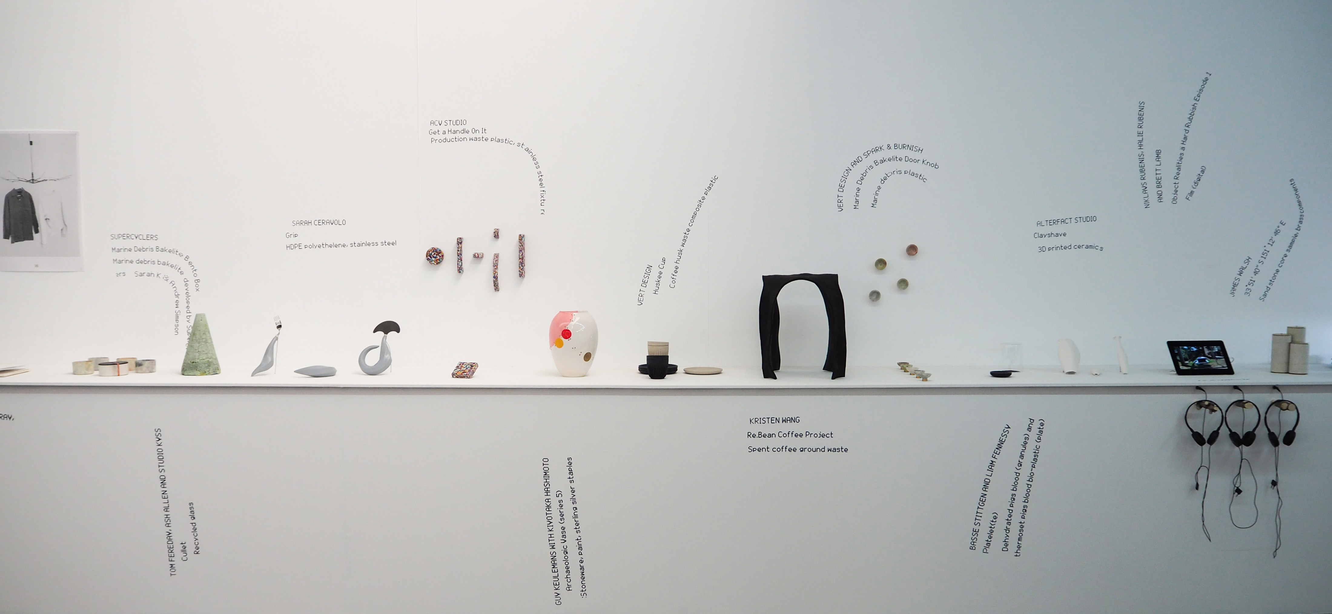
Exhibition review, written by Annelise Turco.

Immediately as I entered the Darren Sylvester exhibition, the clinically clean atmosphere was the first thing I observed. Vibrant white walls covered my surroundings, analogously large framed artworks covered the white walls. Sylvester’s exhibition, ‘CARVE A FUTURE, DEVOUR EVERYTHING, BECOME SOMETHING,’ displays his interests in Pop Culture. Whilst the mix of sculptures and large-scale frames superlatively gained most of the audience’s attention, I was drawn to his illuminated dance floor that was booming loud disco music from the end of the exhibition.

For you’https://www.youtube.com/watch?v=mNDQBOQn3UU1, was a 2013 illuminated dancefloor, reworked on for this current exhibition in 2019. My eyes were drawn to the vibrant neon’s flashing recurrently, constantly juxtaposing with one another and creating a very engaging aesthetic. Without reading the artwork label before entering, I was enchanted in the colours and not sure what I was experiencing- but was enjoying every minute of it. Without the label fixed in my brain, I was left to solve the enigma of what the room meant, “A beholder who lacks the specific code feels lost in a chaos of sounds and rhythms, colours and lines, without rhyme or reason2” Bourdieu statement, contradicts entirely my experience with the dancefloor. I am well educated in art and design, yet without reading the context of the art piece, I would not have assumed it was based on the Yves Saint Laurent’s lipstick collection, embracing its colours through flashing tiles. While Sylvester as a male artist has designed this space for a unisex audience, he was inspired by a well branded lipstick. Pat Kirkham and Judy Attfield suggest that “To gender is not only to code as male or female but also ‘to generate’ – which can, for the purposes of this field of enquiry, be applied to the act of producing meaning3” subconsciously suggesting that if this space were to be gendered as either male or female, it would change the meaning of the atmosphere. In this case, Sylvester’s dancefloor could potentially be labeled to a female disciplinary, and therefore act as a dancefloor for women.

The overwhelming sensations that emerge from the sounded space allow you to be fully amerced and involved. Canadian author Mitchel Canbanac defines a sensation as ‘tridimensional, qualitative, quantitative and effective,4” thereby suggesting that the amount of pleasure I experienced in the space was defined by the amount of stimulus I was receiving. Comparatively, Adam Mack positions that “The leaders of the supermarket industry embraced the age-old associations between pleasures of the proximate senses, gustatory desire, and eroticism in marketing5” thus identifying that my ability to engage and enjoy Sylvester’s work was due to the way its stimulus was combined with all of my senses and the desire caused by the eroticism in its marketing.   

In conclusion, ‘For you’ was an exhilarating experience provided by my heightened emotions and senses. The wall to wall mirrors, vibrant and neon colours paired with the upbeat disco music successfully ended the exhibition visit and I was quite happy I experienced Sylvester’s approach to showcase Pop Culture, pop music, advertising, cinema and fashion.

  1. Darren Sylvester, “Darren Sylvester/Conrad Standish/James Cecil – For You” (Online video), accessed 8thof April, 2019, https://www.youtube.com/watch?v=mNDQBOQn3UU
  2. Pierre Bourdieu, Distinction: A Social Critique of the Judgement of Taste,1984,Cambridge, Mass: Harvard University Press, 1.
  3. Kirkham, P. + Attfield, J. The Gendered Object, Kirkham, P. + Attfield, J. Manchester: Manchester University Press (1996), 4. 
  4. Mitchel Canbanac, “Sensory pleasure,” National Center for Biotechnology Information, U.S National Library of Medicine, accessed April 6th2019, https://www.ncbi.nlm.nih.gov/pubmed/379894.  
  5. Adam Mack, The Senses and Society: The Politics of Good Taste,2006, Oxford, England: Berg Publishers, 87.

My creative outlet

Ines Ting

My own design practice is predominantly centred around illustration. I create under the name XENIX, that I initially launched as a clothing label but now use as my creative platform.

Drawing is may main form of expression, using mainly fine liner or markers for larger scale. Main inspiration is drawn from ideas within punk, street art, skate culture and more. I would describe my work to have a dark, aggressive and sensual aesthetic, with my illustrations incorporating the same eerie alien-like creatures. Beside illustration prints, I’ve produced some apparel, skate decks, a surfboard and have currently started tattooing. 

When it comes to taste, my style has been influenced much more by fine artists compared to graphic designers despite studying communication design. One of the first artists who largely influenced my style was Claire Boucher, more commonly known as Grimes, a Canadian singer and song writer.  She produces  music that has a dream pop, electronic music sound, categorised as synth-pop. She also creates all the art her album covers, her album cover for Visions (2012) , being the artwork that majorly caught my eye with its dark punk skull illustration. All her other work greatly inspires me, alien like female characters being the salient element of her drawings, very similar to mine. By listening to her music, I can see how her style parallels and is translated between her sweet and hazy sound and unique art.  

Another artist whom I admire is Del Kathryn Barton, an Australian artist who creates a range of art from paintings to illustrations and collage. She is best known for her whimsical images of animals and people using a gouache, glitter, marker and sequins. The combination of how she merges animal and human structure together blended with natural elements such as organic forms and plants, forming a fanciful hybrid is what I find amazing.  The use of colour and mixed media is also super impressive, producing psychedelic images. 

Due to my elective last year of screen printing, I was able to learn how to manually screen print. The poster work I made reminds me of the same style that the Earthworks Poster Collective were producing between the late 1960s and early 1990s. They used “anarchic language, photographic imagery appropriated from the mass media and the use of fluorescent poster inks DIY aesthetic” (Berry, 2009). They also screen printed as a means to produce due to the cost effectiveness of the process. Their work was influenced by 1970s British punk fanzines which also parallels to my roots of inspiration. Although their poster work were centred around social and political issues unlike mine, the same do it yourself style is adopted. Other prints I made via screen-printing were adopted onto textile as I printed them on tees and released them on XENIX as ‘Raw Rebellion,’ a punk driven satanic looking graphic.

I have also established a music and art collective with five mates called Synesthetic running club events and day parties. I take part in the art direction designing most of the poster, making art installations, calico banners and sometimes framed illustration for the ‘art exhibition’ element to our events. I also help with the overall event management. Being apart of the music scene develops a close relationship to poster making, a comment made by Mike Callaghan, a member of the Earthworks Poster Collective in the 1979 (Poyner, 2013). An inspiration of mine with poster design is Melbourne based Darren Oorloff, his influence from the 90s rave culture is also evident in his work such as having sci-fi elements incorporated and using fluorescent colours. Having my own creative outlet allows me to slowly build my own brand and curating a music and art collective also means I can develop other skills.

Bibliography

J. Berry, ‘Earthworks and Beyond, Chapter Eleven’ , pages 182-197, 2009.

R. Poyner, ‘Design Observer, Inkahoots and Socially Concerned Design: Part 1’, 2013. http://designobserver.com/feature/inkahoots-and-socially-concerned-design-part-1/37948

The Store, 2017, ‘The Artist: Del Kathryn Barton’, https://www.thestore.com.au/category/artists/del-kathryn-barton?gclid=EAIaIQobChMIpJb36O_C4QIVFa6WCh2Nvg1SEAAYASAAEgJLO_D_BwE, accessed 9 April 2018.

D. Oorloff, 2019 ,http://darrenoorloff.com, accessed 9 April 2018.

Maddie Whitby Design

It’s hard to pin point who I am inspired by most and who influences my work as I have a very broad range of mediums and styles. The reason I don’t have a consistency in my work is because I love exploring different art mediums and combining them with design which best reflects the current concept I have drawn from, from the brief. I am therefore constantly getting new influences from different artists and designers to inspire my work. I am also generally inspired by the world around me and always get the opportunity to reflect what I’ve recently learnt about a random topic in my current project. 

At this stage I think the main idea of what type of designer I am or what designer I might become will encompass the concept ‘collaboration’. That could involve the collaboration of art mediums, art with design, design practices, people or concepts. 

Projects

This is a loom weaving which was inspired by a women by the name of Juliane Koepcke who I had recently learnt about on a podcast. Juliane was dropped into the amazon jungle of Peru after a plane wreckage and survived the landing and 10 days in the jungle with no food, water, supplies or glasses, which she heavily relied on. 1 The brief was to represent any person that you admired in either a CD cover, a poster or a website. The art medium of loom weaving was inspired from my recent trip to Oaxaca in Mexico so I attempted to represent a jungle landscape through this medium.

There were many talented artists who I drew inspiration from but one that particularly inspired me for this project were Lauren and Kass Hernandez who are an Australian sister duo based in Sydney. 2 They launched their ‘brand’ crossing threads in 2015 and celebrate the revival of the handmade through their highly textural and more modern wall hangings. Their work embraces nature and more specifically Australian landscape that surrounds them. 3

This cotton tree installation was inspired by ‘off-the-grid’ living. I had recently started learning more about sustainability and watched a documentary about living off-the-grid. I chose to create a cotton tree installation as cotton is the most widely used natural fibre cloth in clothing today. Because of cotton’s biodegradable properties, all-cotton clothing and materials can also be recycled and used in the manufacture of useful materials. Therefore, I chose it to represent ‘off-the-grid’ living as I thought it was very fitting.

I drew a lot of inspiration for this work from the installation artist Rebecca Louise Law. Law is best known for her creations with natural materials such as flowers. 4 She blurs the lines between the artwork and the audience by creating the installation so the viewer can become involved in it by walking so closely underneath it and through it.

Most of my work I have completed (above) has some form of tactile element which I think reflects the person I am. I don’t want to be a designer who sits behind a computer everyday because I’ve found that’s not what motivates me.

In a world that is moving to all digital mediums I think we are losing the personal touch which is what makes us human. I think if we combine the two we will be able to connect to the audience on a different level.

Further reading about in reference to crossing the boarders between art and design. ‘Transformation of the Aesthetic: Art as Participatory Design’. 5

MaddieWhitby
  1. Do go on, podcast. https://www.planetbroadcasting.com/our-shows/do-go-on/.

2. My modern met. https://mymodernmet.com/fiber-art-woven-wall-hangings- crossing-threads/ (accessed April 5th 2019).

3. Crossing threads. https://crossingthreads.co/about (accessed April 5th 2019).

4. rebeccalouiselaw. https://www.rebeccalouiselaw.com (accessed April 5th 2019).

5. Matthew Holt (2015) Transformation of the Aesthetic: Art as Participatory Design, Design and Culture, 7:2, 143-165, DOI: 10.1080/17547075.2015.1051781

Welcome to Wasteland

‘Waste is just raw material with a bad name’.

Welcome to Wasteland showcases projects from all areas of creative disciplines including architects, industrial designers, furniture makers and researchers and explores ‘the use of waste materials, offering visitors an insight into how leading practitioners are approaching Australian waste issues, not just with a sense of obligation but as an opportunity of crisis.’ 1

The exhibition was launched on the 22nd of March as part of NGV’s design week and I arrived at the exhibition on the first day of design week so I was pleased to see it was really quiet. I got the opportunity to be taken around the exhibition individually by someone who could explain all the artworks for me and could therefore ask questions. It turned into more of a conversation between her and I, instead of just being spoken to about the work which was great because I ask lots of questions!

Everything considered

The Exhibition as a whole was considered of how it could be run most sustainably. The artists name and art descriptions were printed by a print on ‘gun’ appliance instead of using plaques or stickers. They definitely took advantage of the technique by curving the text and making patterns which you couldn’t do as freely with plaques or stickers. 


A large solar panel was also situated outside of the exhibition before you walked inside which generated power to run the exhibitions website.  

The remaining materials leftover from the art pieces were also not ignored as they were collected to create another artwork in the middle of the exhibition.

Artwork

‘A discrete infinity’

The artists that really pushed my thinking around waste were Matt Lenz and Paul Mylecharane (Public Office) 3 who designed a small but radical installation together called ‘A discrete infinity’ about technological waste. 


  • When you walk into the exhibition there is only silence and the sound of a very small monitor beeping. The beep is recording every time someone’s phone in a small radius either gets a notification from social media or a text message. To show a visual representation to support this there is also a screen behind the monitor recording the beeps. I think the artists really pushed the boundaries in considering what is ‘waste’ and to cause further questions around what is ‘waste’. 

Materials:

Chromium Browser, Networked Raspberry Pi, Mac Mini and Open Source Code

“Each moment we spend interacting with our personal devices, we secrete. Much like spiders, we are weaving webs that map our daily movements, our interactions, spending habits and predispositions. ‘A Discrete Infinity’ is a durational, generative artwork momentarily responding to the chirping of the network; to the ephemeral footprint we leave behind unknowingly.” 5


The creatives included in the exhibition were either already practicing sustainability or were asked to create something new for the exhibition. The exhibition asked me to consider things that I wouldn’t have normally considered that contribute to waste and inspired me to design my own sustainable object for my current sustainability project.

Follow the link to further explore the artworks to see how they have used unusable materials in there work to create everyday useable items in their attempt to compete with the world of over consumerism which is the leading cause for our natural environment disappearing. 4

http://solar.friendsand.associates/chromium-browser-networked-raspberry-pi-mac-mini-and-open-source-code/ 5

.

  1. NGV,. Welcome to Wasteland. https://www.ngv.vic.gov.au/program/welcome-to wasteland/. (accessed April 2nd, 2019).

2. The ‘Waste is just raw material with a bad name’ quote was said someone who ran the exhibition and then repeated to me by the person who explained all the projects in the exhibition.

3. Public office. https://public-office.info (Accessed April 6th, 2019)

4. de Blas, Alexandra. “Making the shift: from consumerism to sustainability.” Ecos, Feb.-Mar. 2010, p. 10. Academic OneFile, http://link.galegroup.com.ezproxy.lib.monash.edu.au/apps/doc/A223748661/AONE?u=monash&sid=AONE&xid=c4998886. Accessed 11 Apr. 2019.

5. Solar friends and associates. http://solar.friendsand.associates/chromium- browser-networked-raspberry-pi-mac-mini-and-open-source-code/. (accessed March 26th, 2019.)

Femme-powerment

Ines Ting

One afternoon I visited Designing Women, a temporary exhibition at the National Gallery of Victoria in the city of Melbourne. Located on the third floor was an exhibition showcasing womens design, an industry that has throughout history, been male dominated. The showroom upstairs was relatively small, with the walls painted black, creating an intimate environment in which the viewer follows a serpent like foot path, making them circle around the works to see from all angles. The room was sparse, with elderly couples predominate, although there were some engaging information panels made seperate For Kids. The works were divided into four categories, Leadership, Community, Teamwork and Research (Women in Design). The designs themselves when collated together were all rather random, accentuating the diversity and creativity in the design field. Works ranging from a real life sized horse figurine made into a lamp, to haute couture dresses, Indigenous design and futuristic furniture. 

As I entered the room, the first design I observed and that stood out to me was a furniture design titled Ghost, a curvaceous and contemporary glass armchair. It was produced in 2016 and designed in 1987 by Cini Boeri and Tomu Katayanagi in collaboration for an Italian manufacturer Fiam. Due to the coloured lighting and purple back wall, discrete reflections of the lights mirrored onto the glass surface. 

Ghost by Cini Boeri and Tomu Katayanag

Continuing into the next section, another piece that stood out was Linda Jackson’s Tiwi outfit, a piece made in collaboration with Josette Orsto’s silk batiks and other Indigenous artists and art centres. The collation of Indigenous necklaces were collected by Jackson and the prints on her batiks take inspiration and reference from Tiwi Island performers during ceremonies. Her visits to the numerous communities conveys she has worked and met people in order to obtain the knowledge to authentically represent Indigenous culture (Australian Indigenous Design Charter). Yvonne Koolmatrie’s woven fish scoop out of sedge was also created through the sharing of knowledge as she uses Ngarrindijeri coil and the bundle technique, she says a “skill, and the grass itself, are gifts of the old people.” 

Tiwi outfit by Linda Jackson

Personally I found the exhibition rather erratic. Designs from all over the world with inspirations drawn from different art periods and a range of cultures. Within each type of design there was no border of what was exhibited. In the fashion design industry, Dress by Dutch designer Iris van Herpen was made for singer Bjork, made of acrylic, nylon and metal with the method of 3D printing. This juxtaposes another fashion item by Lee Darroch, a possum skin cloak that represents and honours her family heritage. 

The exhibition showcased a majority of industrial designs and a few fashion design pieces and reminds us about despite the lower numbers of women designers, so “much potential may be lost through the discouragement of creative women” if their work like these are not celebrated (Bruce, 1990).  After reading that the number of women employed as industrial designers in industry show them as less than 1% (Bruce, 1990), it is relieving to see an exhibition dedicated to display womens design.  

Bibliography

M. Bruce, 2009. Design Studies, ‘Women designer- is there a gender trap?’, Vol 11 N2 April, pages 114-120, accessed 1 April 2019.

R. Kennedy and M. Kelly Australian Indigenous Design Charter, pages 1-22, accessed 1 April 2019.

V. Margolin, 2013, ‘Design Studies: Tasks and Challenges’, The Design Journal, 16:4, 400-407, DOI: 10.2752/175630613X13746645186043, accessed 1 April 2019.

National Gallery of Victoria, temporary exhibition ‘Women in Design’ from 28 Sep 18 – 29 Sep 19, visited 28th March 2019.

Design Disruptors

Written by Kelly Wong

My design practice is based on my personal identity and is shaped by how I see myself. I think that the designs that I create are shaped by my personal experiences and tastes. I am very interested in typography and that has been influenced by repeated exposure to the current trends in design. I like to create work that I find empowering because I want my design practices to be inspiring to people in the future.

Typographic window art done by Jennet Liaw. Find more of her work on Instagram @jennetliaw.

One of the designers that inspire me to create more would be Jennet Liaw. Liaw is an illustrator, letterer, and designer that is based in New York. She uses social media as a way to showcase her work. One of my favourite large scale letter projects that she completed is her window lettering for Alex and Ani. As mentioned in her caption, she wanted to create this piece to empower women. She advocates for women to build a loving and supportive community with each other. I think that her work executes her message through the choice to make each letter unique. Each letter has its own personality and reflects how bringing difference together is beautiful. Liaw also uses imagery in her work as two hands are reaching for each other in the middle of the piece.

I think that Jennet Liaw is an inspiration for my design practice because she is an Asian American woman that is succeeding in the design industry. As discussed in class, the history of design has been shaped by a male Eurocentric narrative (Connery 2017) and I think that Liaw breaks free from this structure. Her large folio of work is a source of inspiration for burgeoning young designers to keep pushing themselves to create (Mora 2016). As a Canadian-born Chinese female it gives me a sense of pride that there is a successful designer that has a similar background to me.

“It’s so exciting that today, it’s entirely possible for any person with a great idea—no matter what age, education level, budget—to build that idea into something real.”

Jennet Liaw
“We all move forward when we realize how resilient and striking the women around us are.” —Rupi Kaur.

Last year for International Women’s Day I hand lettered a poem by Rupi Kaur to inspire my audience to spread positivity and love to the people in their lives. This relates to Liaw’s work as both work towards female empowerment and creating a supportive environment for the people in our lives.

I want my design practice to help close the gender trap. By making work that reflects my personal identity and empowers the people around me, I hope to inspire future generations just as Liaw’s work has done for me. I think that my design practice also contributes in the breaking down of the gender trap in design. My ideas and my unique perspective on design that stems from my identity can add to the growth of the design industry. Margaret Bruce’s article on the gender trap in design focuses more on the sexual division of labour in design and how women struggle to succeed in the design industry. It focused mostly on the idea that women designers were stuck doing passive work in design because of the circumstances (Bruce 1990). While the article is dated, as it was written twenty-nine years ago, it has shaped my design practice by inspiring me to be less passive. By changing the values behind design and striving for more representation, it sets the trends in the future for more change to be made.


References

Bruce, C 1990, “Women designers—is there a gender trap?”, Design Studies, Butterworth & Co Ltd, Manchester.

Connery, C 2017, “Plotting the Historical Pipeline of Women in Graphic Design”, Design History Australia Research Network, Melbourne.

Liaw, C 2016, “Hustling to a Megabrand”, Communication Arts, Menlo Park.

Mora, C 2016, “Analog Girl in a Digital World: Nike Designer Jennet Liaw”, MissBish, San Diego.

Fashion & Design

Written by Kelly Wong

The exhibition features some dresses from the Jacques Fath and Pacquin fashion houses.

I decided to visit the Krystyna Campbell-Pretty Gift Exhibition at the NGV International in St. Kilda because I am interested in couture fashion. The exhibit features a wide variety of different fashionable objects that were donated to the NGV by Krystyna Campbell-Pretty in honour of her late husband. The collection of dresses, vintage Vogue magazines, and handbags were showcased in several rooms. Every room in the exhibition was staged in a way that highlighted the way the fabric draped or shone a light on the exquisite beading details on some of the bodices. The atmosphere of this exhibit was very peaceful, most of the other patrons were quietly strolling around and taking time to look at each dress carefully. As Mack outlines in his article about the politics of good taste, the sensory experience that the audience partakes in shapes their perception (Mack 2012). I associate the ambient lighting, quiet music, and grand environment of the exhibition with sophistication and upper class. This contributes to my understanding of the exhibition as I immediately assume the artifacts are expensive.

For me, fashion is also visual and social history, reflecting the role, perception and lives of women in society

Krystyna Campbell-Pretty
A collection of dresses designed by Madame GRÈS

The image that I decided to focus on is from the gallery site, but features a selection of the dresses that were on display. In the gallery, these dresses are placed on pedestals and surrounded by paintings. I felt that exhibit relates to the ideas about good taste and good design. Some of the dresses in the other rooms seemed ostentatious and gaudy, while I felt that the dresses in the picture were more timeless and sophisticated. The dresses in this picture were designed by Madame GRÈS and are meant to be evening gowns. The concept of good design and good taste was that they were not synonymous. Good design stems from the intended purpose of the item while good taste is a social construct.

One of the ideas about taste was that people tend to favour more minimal looks because society appreciates subtle displays of wealth. These dresses contribute to the ideas about taste because they all look different, and viewers might have differing opinions on which dresses they like or dislike. Christoforidou’s reading brings up the idea that societal norms influence our emotional reactions to products. (Christoforidou 2012) My own taste favours classic silhouettes and intricate detailing over bold colours and avant-garde forms, this led me to be wowed by these dresses when seeing them in person because they fit my idea of good taste.

Good design, which is separate from good taste, focuses more on whether or not the purpose of the object was met. Regardless of what these dresses look like, the purpose of a dress is to make the wearer feel good. I felt that these dresses were well designed because they don’t look uncomfortable to wear. Other dresses in the exhibit looked beautiful, but difficult to wear for extended periods of time. These dresses use silk to show drama. They work as evening dresses because of the formality of the dress and the material. As long as the people that wore the evening gowns that Madame Grès designed felt empowered and if their own self-image was enhanced, the dress follows ideas about good design.

A cocktail dress designed by Christian Dior in 1955.

When looking at these dresses from a critical perspective, I feel that they were a product of the gender trap in design (Bruce 1990). As outlined in Bruce’s article, women have historically pursued the fashion specialization in design because it is seen as more “feminine”. The gendering of design specialties puts designers in boxes. The exhibit combats this by also showcasing fashion items made by male designers like Christian Dior. This exhibition strives to break free from the stereotypes that certain areas of design can only be done by a certain gender.

Overall, I enjoyed the exhibit because I felt like it featured a wide variety of dresses that could appeal to audiences with different tastes. I also think that the exhibit showcased the trends in fashion and how it has changed throughout history. They reflect the changes in the taste of society and are a representation of how taste and design are a product of modernism. I would be excited to visit an exhibit like this in the future and see more recent designs being showcased to show future generations what “good taste” was in the year 2019.


References

Bruce, C 1990, “Women designers—is there a gender trap?”, Design Studies, Butterworth & Co Ltd, Manchester.

Christoforidou, C 2012, “Good Taste vs. Good Design: A Tug of War in the Light of Bling”, The Design Journal, Sweden.

Mack, C 2012, “The Politics of Good Taste”, The Senses and Society, United Kingdom.

N.A., C 2019, “The Krystyna Campbell-Pretty Fashion Gift”, Arts Review, Melbourne.

More Than Just Furniture: Furnishing Cupra

Words: Maggie Zhou

The broken relationship and continual mistreatment of Aboriginals in design captured my attention after a captivating lecture by Brian Martin. Naturally, I thought I’d explore the exhibition ‘Furnishing Cupra’ in Blak Dot Gallery.

The Australian Indigenous Design Charter: Communication Design (AIDC:CD) exists to provide information and guidance on the “creation, distribution and ownership of Australian Aboriginal and Torres Strait Islander visual and media arts.” (Kennedy & Kelly, 2016)

IMG_6870

A sense of calm immediately envelops you as you enter the quiet side street of Siteworks, where Blak Dot Gallery resides. The dark building has a striking mural of an Indigenous child peering up towards the sky, with hope in their eyes. On the other side of the wall is a contrasting mural of hand-drawn, curvaceous shapes – the Indigenous and non-Indigenous artforms already starting to collide.

DSC_7420
Source: OFFICE

‘Furnishing Cupra’ showcases furniture that has been created from salvaged surplus River Red Gum from an abandoned milling operation on Culpra Station. As a “cross-cultural collaboration”, it’s an act of reconciliation. (Blak Dot Gallery, 2019) It is joint project between the Culpra Milli Aboriginal Corporation (CMAC), an Aboriginal organisation that holds and manages land for its members, and OFFICE, a multidisciplinary not-for-profit design studio who uses design to “create outcomes for the public good.” (Blak Dot Gallery, 2019)

Notedly, OFFICE has had a relationship with CMAC and the Pearce Family, the custodians of Culpra Station, for the last six years. One of AIDC:CD’s guidelines how all collaboration, co-creation and procurement should be genuine. It’s understood that these relationships are built up over time, with a foundation of patience, transparency and inclusiveness.

DSC_7333
Source: OFFICE

As you walk inside the gallery, the smell is the first thing you notice – the strong, earthy smell of wood.

A stark two-metre-long piece of wood is hung in the middle of the black wall. The top layer of the unassuming tree bark has been neatly cut to reveal a warm, red-toned smooth wood. While smooth, it’s highly detailed and lined with undulating curves.

DSC_7387
Source: OFFICE

There are three tables and nine stools scattered around the small room. The wood has retained its unique markings, every piece is markedly different. On top of the tables are natural decorations – feathers, grass weaving, baskets and other handmade items. It makes me question how normalised mass-produced furniture really is.

IMG_5825
Source: OFFICE

On the wall, there are three projections of the vast Australian landscape. “The things about red gums is…” the subtitles of a silent documentary about the building of a canoe begins. The video continues to talk about ethical usage of the earth. The bark and the water is all in fair usage – “you wouldn’t cause harm to it,” the video remarks.

As I exit the exhibition, I’m met with the courtyard of Siteworks. The wooden crates and tables incite a curiosity within me. I wonder where, how and who made them. The gallery is merely a tiny, black rectangular room. It makes me think – it’s not what’s in the gallery that really matters, it’s what it leaves you with afterwards that does.


REFERENCES

Kennedy, R., & Kelly, M. (2016). Australian Indigenous Design Charter – Communication Design. Australia, Melbourne: Deakin University.

Blak Dot Gallery. (2019). Furnishing Cupra. Retrieved fromhttps://blakdot.com.au/current-exhibitions/2019/2/1/furnishing-culpra

.

A Race To Create

An insight into my design practice | Words by Maggie Zhou

Since I can remember, my work and creativity have been intrinsically linked to my racial identity. They say you write and create from what you know, and I can definitely see that play out throughout my photography. Being an Australian-born Chinese female, I’ve often felt stuck between two worlds, not really knowing where I belong. Heightened by the media’s lack of Asian representation (or their damaging stereotypes), I’ve always sought to document Asian identities as they truly are: individualistic, unique and multi-dimensional.

This same mindset is shared in Dimeji Onafuwa’s 2018 article. He notes that “coloniality, modernity, and design are inextricably linked.” This similar perspective is portrayed in Tony Fry’s article. He shines light upon how marginality is not just about the locations of marginalised communities, but how it is more a state of mind. Marginality “is being on the edge or outside of the relations of exchange, no matter where [one may be] located.” (Fry, 1989) This collision of identities is highly prominent in Australia. We boast of being multicultural yet there is still an obvious conflict between races.

I really resonated with the idea of ‘Respectful Design’ mentioned in Onafuwa’s article. Elizabeth (Dori) Tunstall, a design anthropologist, researcher, academic leader, writer, and educator, created this program to question the role of allies in design. She aims to amplify the voices of the oppressed by “repatriating the ownership of aesthetic cultures instead of the over-simplification of how such cultures are represented” in mainstream designs. (Onafuwa, 2018)

Screen Shot 2019-04-08 at 1.50.05 pm.png
‘This is a Celebration of Us.’ Photography: Maggie Zhou

This is seen in my photographic series ‘This is a Celebration of Us’. I begin with a written piece.

“We are not just your Asian grocery store owners, your $2 discount shopkeepers of your karate instructors. We are not merely your masseuses or your manicurists…”

By directly shining light on the damaging stereotypes invading our daily lives, I begin to showcase the three-dimensional and complex characters of the Asian race.

Screen Shot 2019-04-08 at 1.49.54 pm

Screen Shot 2019-04-08 at 1.49.31 pm

Screen Shot 2019-04-08 at 1.50.23 pm

I photographed two of my friends, who are also Monash Communication Design students, for their bold and experimental fashion style. Coming from New Zealand and Brunei respectively, I wanted to explore different Asian backgrounds and personalities. Dressed in unique and quirky outfits, I photographed them against cliché backgrounds, one shopfront literally called ‘Oriental Discount Shop.”

One established designer who I deeply admire is Alexander Wang. Wang is a Taiwanese fashion designer born in San Francisco in 1983. With his lines stocked in over 700 stores globally, he is recognised as one of the 21stcentury’s most influential fashion designers.

Screen Shot 2019-04-08 at 1.24.42 pm.png
Alexander Wang ‘Collection 1’ 2019

His Asian heritage plays a large part in his designs. The inclusion of Asian models, the repetitive use of red and other cultural symbols such as Chinese characters and headpieces are a common thread throughout collections.

Screen Shot 2019-04-08 at 1.18.29 pm

On his homepage, Chinese rapper Vava stars in his latest campaign. Underneath a yum cha table, she’s edgy and daring, yet Wang still plays with traditional cultural symbols. (Newby, 2019)

This serves as an example of a successful designer embracing his cultural heritage for his art practices. And that’s pretty inspiring to me.


REFERENCES

Fry, T. (1989) A Geography of Power: Design History and Marginality. Design Issues.  Cambridge: The MIT Press

Newby, J. (2019) Chinese Rap Queen Vava Fronts New Alexander Wang Campaign. Radii China. Retrived from: https://radiichina.com/chinese-rap-queen-vava-fronts-new-alexander-wang-campaign/

Onafuwa, D. (2018) Allies and Decoloniality: A Review of the Intersectional Perspectives on Design, Politics, and Power Symposium, Design and Culture. Cambridge: The MIT Press

From Bark to Neon – NGV

exhibition review

I went to the exhibition on this busy sunny friday afternoon. After days of sombre rain, everyone is out in the city and Swanston street is busy as usual. At federation square where the Ian Potter Museum is located, there are people relaxing on the steps, chatting or waiting for their friends at this iconic landmark and popular meetup point of Melbourne CBD. As we walk into the NGV building, the world inside seems so quiet and undisturbed.

The gallery is like a hidden gem deeply embedded in this brutalist architecture with large panels of geommetrically devided exterior. Approaching the entrence, I can already hear sporadic art critics’ whispering, meanwhile there are some people strolling alone amongst the artworks immersing in the artistic atmosphere.

First artwork coming to my view is an oil on canvas painting titled Childhood Dreaming. Its vibrant use of colour, sophisticated composition and unfettered surrealism has set the tone for the whole show. As I explore deeper into the exhibition, I see the word “dreaming” becoming a repetitive theme.

Across the room, we see a triptych of photographs composed of haphazard objects which i find quite intriguingly gruesome yet couldn’t wrap my head around what the message may be. Upon reading the labels, I learned that the artist Deacon employed the “el cheapo” technique, adding her own brand of humour, subverts familiar icons (in this triptych, smiley emoji and Mickey Mouse) to slam the modern society’s way of living and choice of entertainment. I find abstract artworks more enjoyable without excessive interpretations of design motifs, cynicism can be tacky when the artist impose unnecessary connections of politics and social issues onto their art.

The following section in the next room is neon themed. Very instagram aesthetic – everyone was taking photos of them, the symbols and Kamilaroi words expresses patriotism to their land and pays respect to all Aboriginal people, from environments both urban and remote, and anywhere in between. I love the concept of voicing traditional values through comtemporary mediums, “respectful design as a mode of creating new narratives of decoloniality that highlight the work of new allies – settlers with a different ethos – and begin to redefine “whiteness” as a new identity that is inclusive, and is sharable with others” [1]. It’s a resourceful way to engage larger groups of audiences and exporting cultures to different demographics.

Majority of the paintings are earth toned acrylic paints with repetition of patterns – dots, cross hatching, circles, spirals, lines and dashes etc. “Aboriginal artworks painted in acrylic are a beautiful blend of traditional and contemporary. The dot technique gives the painting an almost 3D effect and a sense of movement and rhythm. Many people comment that the paintings look alive and that they literally seem to jump out at you. The flat canvas comes to life with energy and vivacity just like the dreamings and rituals that inspired them” [2]. Made with a palette of very few colours, intensely marked and layered, creating textual variations and many nuances of pink and white. It’s amazing how the simplest of colours and marks can build such rhythmic yet telling narratives.

This painting hidden in a quite inconspicuous corner of the exhibition caught my eye, the use of shimmery blue really popped and complimented the mood of the entire show, and at the top, the english inscription narrates its back story – “indigenous stealing tomatos from white people to feed their family in the 50s”, while the tone is nonchalantly neutral, it really made me wonder the walks of lifes between different racial demographics back in the day.

Towards the end of the exhibition, its style takes a turn to a more futuristic direction. I came across these images that are such sudden change of artistic styles, integrating digtal arts after all the earthy paintings we just walked through. Titled Invasion, the series is a contemporary re-imagining and inversion of the “arrival” of Europeans in Australia. “The aesthetic of the 1960s is beautifully captured, down to the muted London light, grainy skies, heightened drama, tweed suits and mini-skirts” [3]. Artist Michael Cook shows the moment of encounter as an experience of imminent danger and terror, alluding to the experiences of Aboriginal people in the 1700s and 1800s Australia. Rather than recreating this experience in a naturalistic way, Cook has recast the invaders as oversized Australian animals, and the invaded as contemporary residents on the streets of London.

The topics of aboriginals in Australia always tend to touch a nerve when being brought up, as a result it doesn’t get discussed and educated enough. As a design student, also as a member of our multicultural society, I appreciate the bold moves of expressing and celebrating cultures through the form of arts, “by adopting respectful knowledgesharing methods of practices, communication designers can help build cross-cultural understanding and break down barriers of ignorance within the broader community” [4], artists like them encourage us all to develop a renewed appreciation of the diversity of indigenous practice as a framework for cultural change and mutual respect.

Reference:

  1. Onafuwa, D. (2018). Allies and Decoloniality: A Review of the Intersectional Perspectives on Design, Politics, and Power Symposium.
  2. Aboriginal Art Gallery. (2018). Aboriginal Dot Art. https://www.aboriginal-art-australia.com/aboriginal-art-library/aboriginal-dot-art-behind-the-dots/ [Accessed 3 Apr, 2019]
  3. Tanzer, D. (2018). Invasion: This is No Fantasy. https://thisisnofantasy.com/exhibition/invasion/ [Accessed 3 Apr, 2019].
  4. Kennedy, R. (2015). Australian Indigenous Design Charter – Communication Design. Australia, Melbourne: Deakin Univeristy.