Harold Thomas and the Aboriginal flag

In the 2000 Sydney Olympic Games, except for the flag of Australia, the Aboriginal flag was permitted to be flown during the Olympic Games as well.[1] Harold Thomas, who designed this flag which is conveying “concepts of great profundity for Indigenous Australians.”[2], undoubtedly achieved great success. This blog will discuss how the aboriginal designers influence the Australian society.

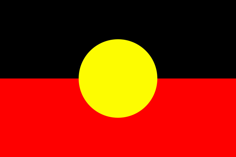
The Aboriginal flag is divided horizontally into two parts, the upper half is black and lower is red. A yellow circle sits at the center of the flag. These three colors symbolize the unique meaning: black represents the Aboriginal people of Australia; yellow is symbolic of the Sun, the giver of life and protector; red represents the red ochre. As stated by Mathieu Gallois, “the flag describes the relationship of people to land, land to culture, and culture to identity.” [3]

Harold Thomas was born in an indigenous family in 1947. He was in the margin of Australia. At the age of six, he was taken to the Alice Spring away from his family. Since then he lived in white institutions and white culture context. These two different culture contexts derived his thoughts about the Aboriginal flag.[4] Within the social context when the government of Australian start working on the affairs like authority for women, social justice and equality,etc, aboriginal artists were aroused the goals to propagate the aboriginal culture in the marginal part of Australian, to claim that they were part of the Australian culture. As Tony Fury said, “A nonuniversal design history is not simply an additional or supplemental approach within a plurality of positions. Rather, it is a fundamental challenge to the nature and authority of the current Eurocentric models of history writing. It will not be based on the same agenda, objects, rhetoric, or concerns.”[5]

What Harold Thomas was expressing through the Aboriginal flag was the identity, political activist agendas and ideals for the displaced Indigenous people.[6] The Aboriginal flag is not for claiming against colonization or the land for aboriginal people. The flag was a way for aboriginal culture to be accepted by the society. Whereas, “Australians do not know or understand Aboriginal culture; or, more specifically, the flag’s non-status as art reflects a poor understanding of the role of culture in Indigenous activism.”[7] It is understandable that the flag cannot be considered as a piece of art work without exchanging the culture. “Products’ beauty emanates from the user’s conscious reflection and experience influenced by knowledge, learning and culture.” [8]Even if the Aboriginal flag is not a product, the beauty of aboriginal culture cannot be conveyed unless people are taught “a body of knowledge and critical perspective”.

Not only Harold Thomas, but also many other aboriginal designers are working on this in obscurity. The Aboriginal flag is undoubtedly the most influential one of them while it still has not been fully accepted by the Australians. How do you think about the aboriginal culture? Is it possible to fully combine the aboriginal culture with the Australian society?


[1] Aboriginal flag, The Australian Institute of Aboriginal and Torres Strait Islander Studies, https://aiatsis.gov.au/explore/articles/aboriginal-flag

[2] Mathieu Gallois, “The Aboriginal flag as art”, Australian Aboriginal Studies, (Fall 2016): p46+

[3] Ibid;

[4] Ibid;

[5] Tony Fry,” A Geography of Power: Design History and Marginality “, Design Issues, (Autumn 1989) ,29

[6] Mathieu Gallois, “The Aboriginal flag as art”, Australian Aboriginal Studies, (Fall 2016): p46+

[7] Ibid;

[8] Despina Christoforidou, Elin Olander, Anders Warell and Lisbeth Svengren Holm, “Good Taste vs. Good Design: A Tug of War in the Light of Bling”, The Design Journal ,188

Female design or design female?

After seeing all three exhibitions, “Designing Women” left a deep impression on me.  The exhibition was divided into four parts: Leadership, Community, Teamwork and Research, revealing how female designers contributing themselves to the design industry which was considered to be Patriarchal. This blog is researching about how the female designers influenced the gender equality in design industry, starting with the artwork “Security pass, access all areas” by Susan Cohn in 1989.[1]

The Using of the red color delights the viewers because the security pass is usually in black and white which is clear but boring. So the designer added the red cover on it, with a little bit gold, to make it more visually enjoyable.  The hollows on the red cover were carefully arranged.  Those three horizontal bars might appear on the traditional security pass for the information while the dots are placed in a dynamic way. The contrast between them is attractive. Other than this, the word “access all areas” on the back of the security pass, which is partly covered implies that the function of being a security pass for your identity is no longer important. It is more like an ornament.

So we can see that the differences between the designs for mass production and designs by female are obvious. In the work “Security pass, access all areas”, the functionality was separated from the object. Susan Cohn made it more like jewelry which suited women better. Women designers would create products in a unique perspective for female.[2] “Beginning in the early 1980s, feminist research on medicine (reproduction and contraceptive technologies), engineering (domestic technologies and housework), and architecture (domestic space, urban planning, motorways) has explored how technology created by men is in accord with their interests in a way that excludes women, whose values, interests, and needs are fundamentally different from those of men”.[3] In such a patriarchal society at that time, women were placed in margin.  According to Tony Fry, “Design history on and in the margins [the “other” story and (her)story of (his)story] is a different kind of history.” [4]Because being in the different positions, people will start to think in an unusual way. The female designer leaders do make progress on gender equality and still continue on it.  

Nevertheless, whether designing in a female perspective to address women could fundamentally improve the gender equality?  “Due to women’s omission from the decision-making processes that shape them, such products also strengthen and reproduce the stereotypical images of women in society.”[5]  The gender equality cannot be reached by only producing the women perspective designs. The more vital point is to promote the education of “technology is gender-neutral”.[6]  The mistake is that the designs on textile and graphic are still seen as a supposedly “feminism” design which is actually depreciation. [7] Not until the design subjects turn in to gender-neutral do the female designers be accepted by the whole design industry.

What kind of design might reach the real gender equality?


[1]Security pass, access all areas”,National Gallery of Victoria,
https://www.ngv.vic.gov.au/explore/collection/work/77233/

[2] Pinar Kaygan,” Gender, Technology, and the Designer’s Work: A Feminist Review, ” Design and Culture (April 2016)

[3] Ibid

[4] Tony Fry,” A Geography of Power: Design History and Marginality “, Design Issues, (Autumn 1989) ,29

[5] Pinar Kaygan,” Gender, Technology, and the Designer’s Work: A Feminist Review, ” Design and Culture (April 2016)

[6] Ibid

[7] Jenny Lewis and Margaret Bruce , ” Women designers— is there a gender trap? “, Design Studies,( April 1990 )

Moooi Horse Lamp

Sofia Lagerkvist and Anna Lindgren are members of the Swedish design team Front.

Their work is based on common discussions, explorations and experiments, and they all participate in projects from initial ideas to final products. Front’s design objects often convey to the viewer a story about the design process, conventions in the design field, or materials about the design field. In their work, they assign part of the design to animals, computers or machines. They created an ever-changing interior that created explosives, robotic furniture and a series of inspirations from their fascination with magic.

The front Horse lamp are faithful to the true size of the animal, bringing a fairytale style and true madness. By rejecting abstractions and drawing inspiration from creatures, it provides powerful emotional content that never causes a strong reaction from bystanders. Who wouldn’t want the lantern to light their home? Furniture at first sight loves or loves to hate forever.

Front Design was founded in Stockholm in 2003 Designer Sofia Lagerkvist, Anna Lindgren, Charlotte All graduates are von der Lancken and KatjaSävström Constevere University of Arts, Crafts and Design Stockholm. Scandinavian designer show Artistic attitude towards industrial design, creating height Entertainment and thought-provoking furniture and products. Considered one of the most representative works of Front Design, Lantern, 2006, is a popular animal thing Collection of Dutch design company Moooi, where Natural life-size horse, pig and rabbit Used as a basis for supporting the lampshade and the tabletop.

“Our work is based on team discussions, design exploration, and experience of everyday life. I hope to express the design process behind it, the techniques used, and the materials used. If you can see some novelty from these commonplace things. The elements, then we will succeed.” Anna said in the interview.

The experimental design method has made them gradually emerge in the international arena. 2D graphic design sketches are visualized in 3D. The seemingly simple design technique is also a product with a self-style. The themes they designed combine the four elements of animal, physics, surroundings, and materials. Some products capture small moments in the environment, like the Animals collection, which is assembled from animal labels and footprints. Some products capture the reaction and change, like a straight reflection that just got into the house. They reinterpret and give new life classics such as answering machines, Panton chairs, and a wide variety of traditionally furnished furniture.

Bibliography

Arrom, S. and Franco, J. (1990). Plotting Women: Gender and Representation in Mexico. The Hispanic American Historical Review, 70(4), p.681.

Bruce, M. and Lewis, J. (1990). Women designers — is there a gender trap?. Design Studies, 11(2), pp.114-120.

Lueasygi.com. (2019). Moooi Horse Lamp. [online] Available at: http://www.lueasygi.com/product_info189.html [Accessed 13 Apr. 2019].

Moooi.com. (2019). Horse Lamp | Moooi US. [online] Available at: https://www.moooi.com/us/products/horse-lamp [Accessed 13 Apr. 2019].

Cini Boeri and her Ghostchair

Italian designer Cini Boeri began her career in the 1950s with Achille Castiglioni, Anna Castelli Ferrieri and Vico Magistretti. This was an early, exciting day for industrial design, and when experiments and miracles became part of every project, Italy created the status of a world design superpower.

While for many people, Ghostchairs are more recognizable than designers, for designers, Cini Boeri’s exploration of materials and technology has set a precedent for practice, inspiring today’s designers, including Patricia Urquiola. Its rigor and substance have a cordial affinity. So the irony is that this year marks her most famous design, Ghost chair has been 30 years, she affectionately call you a chair you can not see.

As early as 1987, with the help of Italian furniture group Fiam, Cini came up with a chair that could break through the boundaries of the glass and rekindle her interest in furniture. Tired of designing sofas and chairs, she was keen to create the world’s first piece of furniture made of cast glass bent at high temperatures, without welds, seams, bolts or glue. The experiment was developed with Fiam’s originality, a two-year process that requires expertise, trust and patience.

“I designed this chair, with its ghostly transparency, at a time when I was terribly tired of designing armchairs and sofas… So I said to myself, let’s make one you can’t see!”

Cini Boeri

The design industry itself perpetuates passive behavior Female designers do sedentary female stereotypes Engaged in textiles, fashion and “pretty pictures” (graphics), And men do ‘more rough’ ‘more practical’ work Design consumer and industrial products. we will Like to emphasize the typical “feminization” field Design should not be degraded to encourage More women enter product and industrial design. The Traditionally involved in the feminine skills of jewelry design, Textiles, ceramics and fashion are very popular Creativity is equally important to our aesthetic and aesthetics Commercial futures. They should reevaluate instead of Further slums. Women have truly equal choices and opportunities.

From the perspective of an industrial designer, Cini’s design is creating new view of product should be. Today, the Ghost seat not only represents a moment in history, it also reminds people that the collaboration between the designer and the manufacturer, the groundbreaking production process, is a hidden component of the original design and is part of an eye-catching mixture. Even if we don’t know why.

Bibliography

Arrom, S. and Franco, J. (1990). Plotting Women: Gender and Representation in Mexico. The Hispanic American Historical Review, 70(4), p.681.

Bruce, M. and Lewis, J. (1990). Women designers — is there a gender trap?. Design Studies, 11(2), pp.114-120.

Dzineny.com. (2019). Cini Boeri – DZINENY. [online] Available at: http://dzineny.com/designers/cini-boeri/ [Accessed 12 Apr. 2019].

Mary Robinson Blair

by Renee Sachi Bertol Yu

With plenty of up and coming artist gaining recognition I feel that it is equally as important to remember past designers and artist who have made an impact in our society today. I have personally always been inspired by fairytale books and animated movies, Alice in Wonderland was one of my favourite movies to watch as a small child, and it continues to show and reflect in my work. However, it was not until recently that I discovered the mastermind behind the art works and designs of my favourite movie – Mary Robinson Blair.

After over half a century, American artist, animator, and designer, Mary Blair is finally getting the global recognition that she was denied during a lifetime of personal tragedy and despair. It’s been almost four decades after Mary’s death she is now receiving international acclaim for her work as the principal concept artist and colour stylist on Disney classics; Cinderella, Alice in Wonderland and, Peter Pan, along with her design work on several three-dimensional Disney exhibitions, most notably “It’s a Small World.” Blair passed in 1978, however it was only 1991 when she got inducted into the group of Disney Legends – The Disney Legends Awards is a hall of fame program that recognises individuals who have made an extraordinary and integral contribution to The Walt Disney Company. However I didn’t write this with the intention of depressing you by dwelling on and on about how unfair society was especially back in her time and all the horrible things she had to go through, instead I want this post to celebrate and remember Blair for all her wonderful contributions to our fairytales and many of our childhoods.

Alice in Wonderland Concept Art (1951) by Mary Robinson Blair

Cinderella’s coach rushing to the castle (1950) by Mary Robinson Blair

Peterpan Concept Art (1953) by Mary Robinson Blair

Blair often worked with watercolours and tempera paints for her concept arts – some of which are still being auctioned around the world today. Before she worked for Walt Disney, Mary Blair began her lifelong multifaceted art career in the 1930’s as a member of the prestigious California Watercolor Society.

Backyards (1930) by Mary Robinson Blair

She was almost in her 40’s when she recognised and began to work for Walt Disney. In 1941 her passionate “explosion of colour” style began to emerge during the Disney Studios “South American Goodwill Tour”. For the next 30 years she continued to create works of art for Walt Disney, developing her own colourful and exciting style. You can definitely similarities between her work for Disney and her more personal work.

Violetta (1970) byMary Robinson Blair

This one for example shares a very similar colour palette to the one used in Alice in Wonderland, especially the scenes that involved Cheshire the cat, besides that the painting also has multiple cats, stripes, frills and mirrors which as also very symbolic in the movie.

Fantisea (1970) by Mary Robinson Blair

As she got older, Blair explored different textures, and as her fun and vibrant style began to develop through her art we got to see a teasing and sometimes absurd side of her, unfortunately she passed away before she was given the recognition she deserved. I hope she continues to inspire plenty around the world.

Reference and Image Sources:

Soquel Artist Mary Blair Finally Gets Her Due, Geoffrey Dunn (2014) https://www.santacruz.com/news/soquel-artist-mary-blair-finally-gets-her-due.html

ArtNet, http://www.artnet.com/artists/mary-robinson-blair/

Mary Blair Gallery, http://magicofmaryblair.com/mary-gallery.html

Contextualising my own work

While I often try to keep my design ideas fairly broad and widen my scope as to what I am able to do with my designs, one of the things that I love to utilise in my own design work quite regularly is the idea of ‘pastiche’, that is, the idea of appropriating or imitating the work of another artist, without being as negative as parody or as critical as satire. I often use appropriation in my works because I love the feeling of placing my own spin on an already existing and well known concept or design that already resinates with people. Through pastiche I’m able to take what people already recognise and alter the way they view and perceive some of their already favourite images. In a way for me as well pastiche also allows me to, for lack of a better phrase, ‘pay respect’ to other artists by saying that I love their work so much that I want to encorporate it into my own work. This form of design is used on many different levels, from cartoon to higher design and even into fashion. One designer who’s work I identify with is that of Mike Cherman, a slightly smaller graphic and fashion designer based out of LA California as the founder and designer of ‘Chinatown Market’, a relatively new fashion brand that has rapidly developed over the past 3 years due to Chermans amazing designs as well as a huge work ethic. As Tara Aquino, a blogger for clothing brand The Hundreds puts it, “It’s that kind of intuitive and fearless hustle that’s made him a living legend”. Cherman is known to often ‘bootleg’ existing designs from well known fashion houses or fashion designers. Some of his most famous designs are his Gucci sneakers and hoodies in which he takes the existing Gucci logo and redesigns it in a more hand drawn aesthetic to illustrate the ‘lesser grade’ quality that someone could find at a literal chinatown market of a more high end brand.

Pierre Bourdieu talks about style and taste in his work ‘Distinction: A Social Critique of the Judgement of Taste’ in which he talks about educated individuals being able to decode and understand artists works with a pure gaze, understanding the exact idea behind the work, and I feel that often with Cherman’s and my own work this is often the case. The works are less open for interpretation and more so displaying the meaning for the viewer, obviously with some encoded meanings behind the work but less so than that of a purely open work. Similar to Mike Cherman in this design work of mine I have taken very well known cartoon characters that already resinate with individuals and have displayed them as if they were ‘off set’ or ‘behind the scenes’ of their respective cartoon TV shows as Hollywood actors would be.

This pastiche style is also something that I love exploring because of the way it allows me to work with artworks and designs that I love and also be able to add my own style and design to them to create a completely different work. One of my favourite quotes which illustrates the idea behind pastiche is from American screenwriter Tim Kring who says “I really enjoy the pastiche storytelling of watching seperate stories slowly collide with one another, the audience gets to decipher how one story will connect with another.” Kring is talking about the way in which, in my case, the two artists/designers can collide to make a new piece.

Bibliography

T. Aquino, HOW I GOT HERE: Mike Cherman, Designer & Founder of Chinatown Market, The Hundreds, 2018.
https://thehundreds.com/blogs/content/mike-cherman-chinatown-market-interview-2018

P. Bourdieu, Distinction: A Social Critique of the Judgement of Taste, introduction, pg 4, 1984

T. Kring, pastiche quotes.
https://www.azquotes.com/quotes/topics/pastiche.html

STIGMA: dismantled, revealed

stigma: a mark of disgrace

I find it difficult to talk about mental health. It seems much easier to bring up the weather, or the latest annoyances with public transport, or just anything else instead – which is troubling, because it is reported that nearly 50% of the population will experience a mental disorder at some stage in their lives, whether episodic or persistent.1 Half a population is hardly a minority and yet somehow, still there is a fog of stigma surrounding mental illness. Perhaps it is because of the invisibility of the pain – it is difficult to have conversations about the intangible and deeply personal. Perhaps it is fear, or shame, or ignorance. Whatever the reason, it is precisely this silence that contributes to the isolation, the “other-ing”2, and the misrepresentation of those already struggling.

STIGMA: Dismantled, Revealed is an exhibition showcasing creative practices of seven contemporary artists with lived experiences of mental illness and explores their personal relationships with stigma. It is an affecting example of how meaningful discourse could emerge through empowering marginalised voices to be heard and appreciated.


Untitled, Kylie Steinhardt, 2018.

dismantle: to take apart

Step into the Melbourne Brain Centre and through the unassuming sliding glass doors of The Dax Centre to be greeted by a varied body work – ranging from watercolours, to embroidery, to sculptural mixed media, to a woven installation. The latter is a piece by current Artist in Residence, Jessie Brooks-Dowsett.

Interlaced, Jessie Brooks-Dowsett, 2019.

From across the gallery, Interlaced appears to be a flexible wire mesh in the shape of an open dome, suspended just above head-height. Visually, it piques curiosity. Hanging down beyond the edges of the structure is an assortment of colourful bits and bobs – translucent tubing, reflective streamers, plastic string, to name a few.  They seem incongruous to the overall silhouette, but there is also an unmistakeable carefulness to how they are woven into the wire tapestry. The art of weaving is particularly apt in discussions involving the marginalised – historically it recalls a sense of community 3, of testimonials by those unable to speak under unjust regimes 4, and even of therapeutic healing 5.

However, the form and shape alone of Brook-Dowsett’s work does not fully communicate her considerations about stigma. It is her process in creating it that may be more significant. She had invited gallery visitors to join in her weaving, combining wire and found objects to then later be integrated into the larger installation. There wasn’t a one-sided relationship of art informing viewer. The act of participation and co-creation empowered the artist, who carried her own narratives of stigma, to be the initiator of conversations surrounding mental health.

Artist Brooks-Dowsett, herself, explains in the gallery’s Q&A style panel: “there needs to be more conversations about mental health. It isn’t a binary where you’re healthy on one side and sick on the other. There is a continuum.” 6 Her statement underscores her installation and returns in echoes as you explore other works put forth by fellow exhibiting artists; the issue of stigmatisation exists in interwoven narratives. It is a tangle of various systems – from the collective: institutional and medical discourse, media representations, to the individual: internalised self-perceptions, immediate relationships.


“there needs to be more conversations about mental health. It isn’t a binary where you’re healthy on one side and sick on the other. There is a continuum.”


Jessie Brooks-Dowsett

reveal: to make known what was not

I admire how the exhibition does not attempt to be over-ambitious in its disentanglement of stigma. Instead, stays simple and accessible: affirming a misrepresented group, encouraging individual connections within a safe space, and perhaps more importantly, reminding us of the ways we are participants in each other’s experiences.

A room for visitors to pen responses for the artists.

STIGMA: dismantled, revealed is currently showing until June 7, 2019. The Dax Centre also runs other public programs such as artist conversations and educational experiences. Do support them and find out more at  https://www.daxcentre.org/.

1. Australian Bureau of Statistics, “National Survey of Mental Health and Wellbeing: Summary of Results, 2007”, Australian Bureau of Statistics, accessed April 10 2019, http://www.abs.gov.au/AUSSTATS/abs@.nsf/Lookup/4326.0Main+Features32007?OpenDocument

2. Tony Fry, “A Geography of Power: Design History and Marginality,” Design Issues 6,1 (Autumn 1989): 16.

3. Marie Gravalos, “Conceptualizing community identity through ancient textiles: Technology and the uniformity of practice at Hyalcayan, Peru” (Master’s thesis, Purdue University Graduate School, 2014): 138.

4. Here, I refer to quilts made by slaves in which symbols were used to communicate with escaped slaves.
Lisa Garlock, “Stories in the Cloth: Art Therapy and Narrative Textiles,” Journal of the American Art Therapy Association 33, 2 (2016): 60.

5. In art therapy, story cloth can be used when working with trauma survivors.
Ibid, 61.

6. Monique O’Rafferty, “STIGMA: dismantled, revealed artists in conversation,” SANE Australia, accessed April 10, https://www.sane.org/the-sane-blog/wellbeing/stigma-dismantled-revealed-1.

Carla Mosqueda, 27398684

Hannah Reyes Morales

Gender stereotyping is high in the Philippines 1 and unfortunately, sexist ideals remain pervasive in the communications and media industry. Through the decades, representations of Filipinas has always been controlled, their visibility constituting a “continuously romanticise(d) … imagining of their realities”. 2 It is then disappointing to that local newspapers remain heavy-handed in discriminating against women – one photojournalist job listing only calling for men. 3 The visibility of a female Philippine photographer on a public stage is then so important.

Shelter from Storm Photo Series, Hannah Reyes Morales, 2013.


Manila City Jail Photo Series, Hannah Reyes Morales, 2019.


­Hannah Reyes Morales is a photojournalist based in the Philippines. Her work aims to authentically document local narratives – from the larger than life, to the everyday and intimate. Her work explores individuals in complex situations – from Filipina women who had entered the sex industry after a devastating typhoon, to middle-class seafarers returning home to their family after years away, to inmates suffering the inefficiencies of the Philippine judiciary system.4 The candid quality in her photography, where movement is captured mid-action, alongside minimal post-edit colour treatment, relay a sense of humanity in the subject’s experiences.

Morales acknowledges her challenges in starting out as a female photographer, sharing: “one of the first things I was told was that I was only hired because I was the boss’s type.” 5 She recounts how misogyny initially led her to feel uncomfortable as herself and inauthentic. This can be incredibly damaging in the field of photography, where the photographer’s own perspectives can influence what stories get told, and in turn what images shape the public sphere.

In fact, it is her own personal narratives that lend her images a truthfulness and vulnerability. Remembering her work with rape and trafficking victims, she shares, “being able to talk to these women and relate their story to mine was very eye-opening.” 6 She shares the efforts she puts into trying as much as possible to close the distance between photographer and subject. Connecting with, and not just capturing, the subjects is important to her craft – especially when it comes to documenting experiences which already bear undertones of stigma and alienation.

Invisible City Photo Series, Hannah Reyes Morales, 2018.


As stirring as I find most of her work, Invisible City is the one I find myself drawn back to. It is a photo series that is accompanied by words from Hannah Morales herself. She describes the situation: in the midst of political tensions and bloodshed, images of death, violence and despair were normalized, having been saturated in the media’s discussions of human rights. Wanting to understand sentiments of those directly affected, Morales decided to document everyday narratives and in it, managed to capture moments of human dignity within the violent political atmosphere. It is jarring, it is stark, yet it is also tender.

Claire Raymond’s statement is worth noting, “The mere fact of a woman holding a camera in public … does not mean that the photographs she produces with that camera will be feminist.” 7 While I do not say I disagree, I nevertheless appreciate the women who hold the camera, directing their gazes, no longer just gazed upon.

1. Michael Prieler and Dave Centeno, “Gender Representation in Philippine Television Advertisements,” Sex Roles 69,5-6 (September 2013): 281.

2. Tacata Baicy, “Gazing Upon the Other: The Politics of Representing the Igorot in Philippine Modernism.” (Master’s thesis, The University of Hawai’i at Manoa, 2017),

3. Coconuts Manila, “Female Photographers Blast the Philippine Star for ‘Sexist’ Job Advertisement, ” Coconuts Manila, accessed April 12,
https://coconuts.co/manila/news/female-photographers-blast-philippine-star-sexist-job-advertisment/.

4. Hannah Reyes Morales, “Hannah Reyes Morales,” Hannah Reyes Morales, accessed April 12, 2019, http://hannah.ph/.

5. Kerry Manders, “WOMEN TALK: Hannah Reyes Morales,” Women Photograph, accessed April 11, 2019,
https://www.womenphotograph.com/news/2018/4/30/women-talk.

6. Taken from scmp.com
Laurie Chen, “How an award-winning Filipino photographer overcame personal adversity to excel in her field,” Society, South China Morning Post, Saturday 2 December 2, 2017, accessed April 12, 2019,
https://www.scmp.com/news/hong-kong/community/article/2122329/how-award-winning-filipino-photographer-overcame-personal .

7. Claire Raymond, Women Photographers and Feminist Aesthetics (Routledge, 2017), 87.

Carla Mosqueda, 27398684

Welcome to Wasteland exhibition review

Walking into the exhibition I could immediately feel that this was not going to be a regular exhibition that I’d been to before. With stark white walls and sparse artworks, the gallery really lent itself to the idea of recycled waste with no extra ‘unnecessary’ aesthetics which could potentially distract from the intended subject of the viewers gaze, the artworks. Upon entry to the exhibition we were greeted by a woman named Jordan who ran us through the ins and outs of the space and the works that inhabited it, we were told that a total of 31 artists, both men and women, were asked to participate in the exhibit and were allowed to work with anything under the sun with the one prerequisite being that it was in fact recycled. Materials within the exhibition ranged quite dramatically, from more standard materials such as timber and metal to far more abstract materials such as pigs blood, and everything in between. In our culture today we view ‘waste’ as something that is a by product of another that can simply be burnt or buried then forgotten, and yet there are much better ways of dealing with waste as this group of artists are displaying. Inside the exhibition the artworks were all laid out around the circumference of the square room all facing towards the one central work in the middle of the room which in my opinion epitomised what ‘Welcome to Wasteland’ was all about; the central work was a large pile of debris and waste collected and placed in the centre by all the individual artists. The Waste itself was all of their (the individual artists) respective waste that was created whilst making their works of art, so not a single scrap was wasted.

As I mentioned briefly above, The bland stark white walls of the exhibition which aides the idea of recycled waste with no extra aesthetic is also helped by the dispersion of the works as well as the quiet nature of the space. These combined attributes, I found anyway, gave the viewer an experience that saw them really connect with the idea behind the exhibition itself because it, in a way, made you feel at one with the works themselves; made you feel that the exhibition space wasn’t only for holding the artworks but was itself a work of ark too. The one artwork which really drew my eye for the entirety of my stay at ‘Welcome to Wasteland’ was, as I have briefly already mentioned, the centre piece of the gallery. With no visible name for the piece surrounding it, the artwork really did stand out as being some sort of ‘open work’ which Pierre Bourdieu talks about in his work ‘Distinction: A Social Critique of the Judgement of Taste’ as being a work open to interpretation, having many different meanings and allowing the audience to view and interpret as they wish. As previously said as well, the piece is a combined work of all 31 artists from many different walks of life, both male and female, bringing in the important topic of gender equality within design which hasn’t always been the case historically, as Jane Connory talks about in her 2017 document ‘Plotting the Historical Pipeline of Women in Graphic Design’ in which she says “a woman’s freedom to pursue a graphic design career has been a struggle against the established social order and its gendered expectations.” ‘Welcome to Wasteland’ displays, as well as many other ideas, equality of all sorts through the exhibition and the different artists displaying their respective talents within the gallery.

Bibliography

P. Bourdieu, Distinction: A Social Critique of the Judgement of Taste, introduction, pg 4, 1984

J. Connory, Plotting the Historical Pipeline of Women in Graphic Design, pg 2, 2017

Welcome to Wasteland, 2019
https://www.ngv.vic.gov.au/program/welcome-to-wasteland/

G. Keulemans, Welcome to Wasteland exhibition, catalogue essay, 2019
http://solar.friendsand.associates/manifesto

Katharine Hamnett

Fashion Meets Politics

No history of the political t-shirt could go without mentioning Katharine Hamnett, who caused a stir in the 1980s with her impactful political slogans in bold type.

Katharine Hamnett – one of the pioneers of modern British fashion, strict buddhist, first designer to win the British Fashion Council’s “Designer of the Year” award in 1984. During decades of unbridled consumerism, Hamnett took the rhetoric of advertising and refashioned it for liberal political causes. “Her most famous moment took place upon being invited to a reception at the heart of British political life, 10 Downing Street. Sneaking a t-shirt in under her coat, she shook Margaret Thatcher’s hand wearing ‘58% DON’T WANT PERSHING’, a statement reiterating the public opposition to the Prime Minister granting the US permission to station nuclear missiles on British soil” [1]. The image ended up on the front cover of newspapers, bringing widespread attention to the Campaign for Nuclear Disarmament cause – according to Whitehall legend, it was one of the few times ministers ever saw the Iron Lady visibly rattled.

From then on, Hamnett officially launched the T-shirt’s sartorial power to become a tool for activism, a wearable placard for her passion in current political affiairs and soical justice issues, such as gender equality, high educational costs, environmental sustainability etc. Due to her very over-the-top design motifs and her public dislike of Jacob Rees-Mogg – the British politician who supports Brexit for the conservative party, she has made quite a few political opponents from the very beginning of her design career,being in the centre of controversies is something she has never shield away from. Despite having a considerable amount of cult following which mainly consists of the liberal parties, she struggled to be accpeted into the traditional media and had very little commercial attention due to the nature of her design and the fact that staying politically charged can hold dangers for companies. Hamnett is facing her biggest challenge nowadays as our social climate has became more sensitive than ever – “There was this feeling that you could get away with things. It’s something we don’t have now, with an illiberal government and antiterrorist legislation. You can now be arrested for wearing a “Free Tibet” T-shirt, which is unbelievable. In the 1980s, you could break the rules” [2].

Living by strict buddhlist ethics, Katharine Hamnett has always been environmentally conscious. After finding out cotton agriculture was responsible for 20,000 deaths per year from accidental pesticide poisoning, she jumped on the frontier of “making clothes the greener way”. Not one to sit and patiently wait for tides to change, Katharine quickly cleaned up her practices. Her Autumn/Winter 1989 Clean Up Or Die collection used organic cotton and sustainable fabrics, and in 2005 she designed organic cotton T-shirts for Oxfam’s Make Poverty History campaign.

Katharine Hamnett is the role model we all need – not only did she pioneer the slogan t-shirts and distressed denim trend, she was also one of the first female desginers ambitious enough to put herself out there in the fashion industry back when it was “viewed more as a male trade, in a time when ‘a woman’s dream was generally secretarial stuff or dress making'” [3].

Being the one to subvert unwritten social rules of appropriate pursuits limited options for women was not easy, we have certainly seen a change of climate in the design industry and now that majority of my classmates in the design course are talented females students set to start their career in the field. It is now definitely a much more gender- inclusive environment compared to back when the activists struggled in the 70s.

“Designers are inevitably subject to the ideas and influences of their social context, their designs must reflect their values, and that the growing professionalization of the design business is at present to the advantage of creative people”[4], I hope that in the future, designers like Katharine Hamnett get to be discussed and acknowledged more widely by mainstream media, and her works as well as her great cause would have a larger platform to impact the younger generations.

reference:

  1. Hess, L. (2018). A Brief History of The Political T-shirt. https://www.dazeddigital.com/fashion/article/39007/ [Accessed 10/4/19]
  2. Hamnett, K. (2015). Remembering The 80s. https://www.independent.co.uk/news/uk/this-britain/remembering-the-80s-6101125.html [Accessed 10/4/19]
  3. Connory, J. (2017). Plotting the Historical Pipeline of Women in Graphic Design.
  4. Lewis, J. (1989). Women Designers – Is There a Gender Gap?