Katharine Hamnett

Fashion Meets Politics

No history of the political t-shirt could go without mentioning Katharine Hamnett, who caused a stir in the 1980s with her impactful political slogans in bold type.

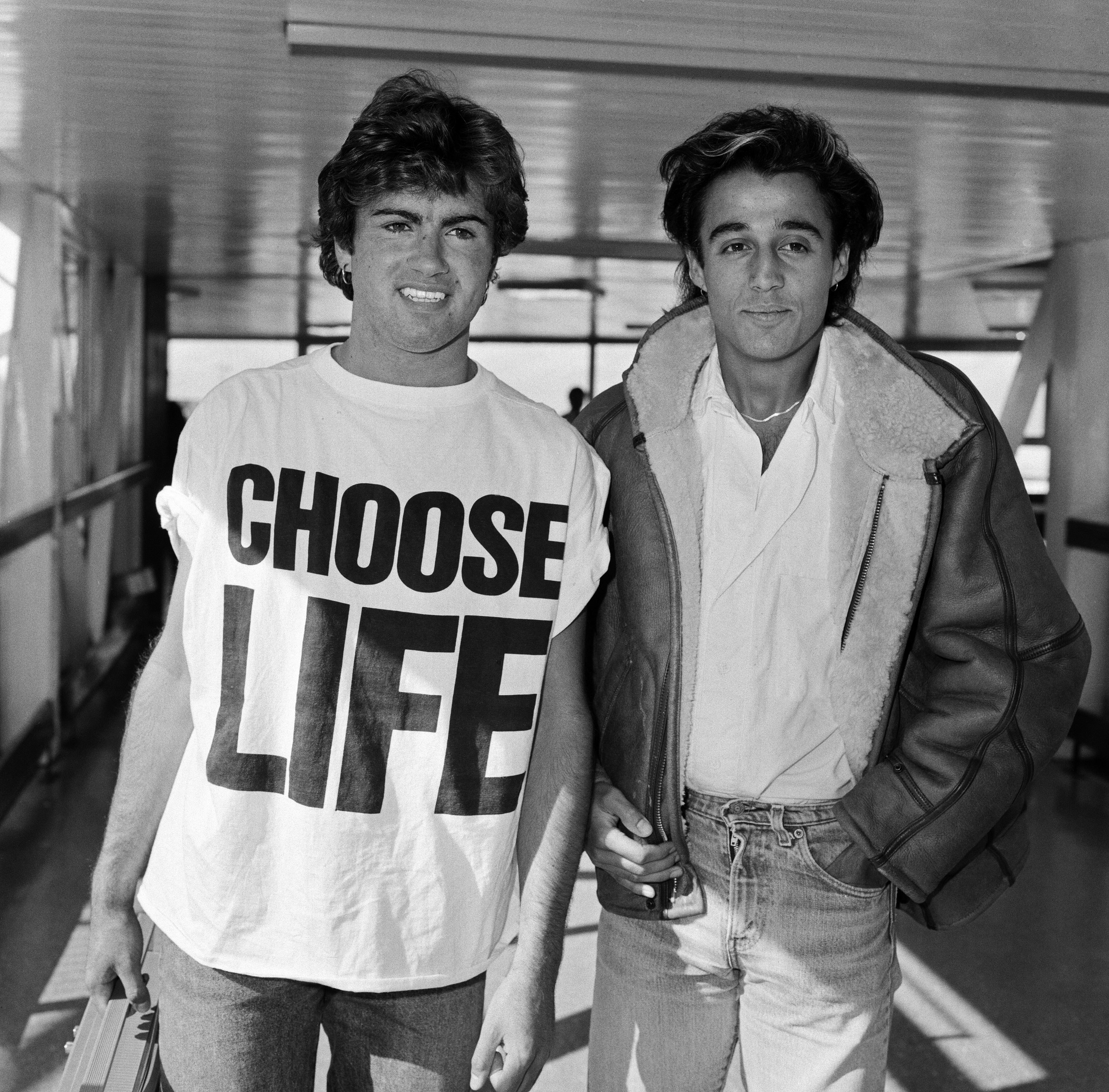
Katharine Hamnett – one of the pioneers of modern British fashion, strict buddhist, first designer to win the British Fashion Council’s “Designer of the Year” award in 1984. During decades of unbridled consumerism, Hamnett took the rhetoric of advertising and refashioned it for liberal political causes. “Her most famous moment took place upon being invited to a reception at the heart of British political life, 10 Downing Street. Sneaking a t-shirt in under her coat, she shook Margaret Thatcher’s hand wearing ‘58% DON’T WANT PERSHING’, a statement reiterating the public opposition to the Prime Minister granting the US permission to station nuclear missiles on British soil” [1]. The image ended up on the front cover of newspapers, bringing widespread attention to the Campaign for Nuclear Disarmament cause – according to Whitehall legend, it was one of the few times ministers ever saw the Iron Lady visibly rattled.

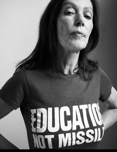
From then on, Hamnett officially launched the T-shirt’s sartorial power to become a tool for activism, a wearable placard for her passion in current political affiairs and soical justice issues, such as gender equality, high educational costs, environmental sustainability etc. Due to her very over-the-top design motifs and her public dislike of Jacob Rees-Mogg – the British politician who supports Brexit for the conservative party, she has made quite a few political opponents from the very beginning of her design career,being in the centre of controversies is something she has never shield away from. Despite having a considerable amount of cult following which mainly consists of the liberal parties, she struggled to be accpeted into the traditional media and had very little commercial attention due to the nature of her design and the fact that staying politically charged can hold dangers for companies. Hamnett is facing her biggest challenge nowadays as our social climate has became more sensitive than ever – “There was this feeling that you could get away with things. It’s something we don’t have now, with an illiberal government and antiterrorist legislation. You can now be arrested for wearing a “Free Tibet” T-shirt, which is unbelievable. In the 1980s, you could break the rules” [2].

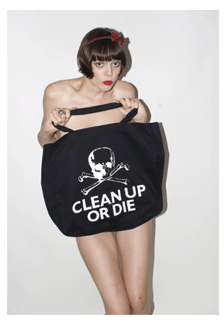
Living by strict buddhlist ethics, Katharine Hamnett has always been environmentally conscious. After finding out cotton agriculture was responsible for 20,000 deaths per year from accidental pesticide poisoning, she jumped on the frontier of “making clothes the greener way”. Not one to sit and patiently wait for tides to change, Katharine quickly cleaned up her practices. Her Autumn/Winter 1989 Clean Up Or Die collection used organic cotton and sustainable fabrics, and in 2005 she designed organic cotton T-shirts for Oxfam’s Make Poverty History campaign.

Katharine Hamnett is the role model we all need – not only did she pioneer the slogan t-shirts and distressed denim trend, she was also one of the first female desginers ambitious enough to put herself out there in the fashion industry back when it was “viewed more as a male trade, in a time when ‘a woman’s dream was generally secretarial stuff or dress making'” [3].

Being the one to subvert unwritten social rules of appropriate pursuits limited options for women was not easy, we have certainly seen a change of climate in the design industry and now that majority of my classmates in the design course are talented females students set to start their career in the field. It is now definitely a much more gender- inclusive environment compared to back when the activists struggled in the 70s.

“Designers are inevitably subject to the ideas and influences of their social context, their designs must reflect their values, and that the growing professionalization of the design business is at present to the advantage of creative people”[4], I hope that in the future, designers like Katharine Hamnett get to be discussed and acknowledged more widely by mainstream media, and her works as well as her great cause would have a larger platform to impact the younger generations.

reference:

  1. Hess, L. (2018). A Brief History of The Political T-shirt. https://www.dazeddigital.com/fashion/article/39007/ [Accessed 10/4/19]
  2. Hamnett, K. (2015). Remembering The 80s. https://www.independent.co.uk/news/uk/this-britain/remembering-the-80s-6101125.html [Accessed 10/4/19]
  3. Connory, J. (2017). Plotting the Historical Pipeline of Women in Graphic Design.
  4. Lewis, J. (1989). Women Designers – Is There a Gender Gap?

From Bark to Neon – NGV

exhibition review

I went to the exhibition on this busy sunny friday afternoon. After days of sombre rain, everyone is out in the city and Swanston street is busy as usual. At federation square where the Ian Potter Museum is located, there are people relaxing on the steps, chatting or waiting for their friends at this iconic landmark and popular meetup point of Melbourne CBD. As we walk into the NGV building, the world inside seems so quiet and undisturbed.

The gallery is like a hidden gem deeply embedded in this brutalist architecture with large panels of geommetrically devided exterior. Approaching the entrence, I can already hear sporadic art critics’ whispering, meanwhile there are some people strolling alone amongst the artworks immersing in the artistic atmosphere.

First artwork coming to my view is an oil on canvas painting titled Childhood Dreaming. Its vibrant use of colour, sophisticated composition and unfettered surrealism has set the tone for the whole show. As I explore deeper into the exhibition, I see the word “dreaming” becoming a repetitive theme.

Across the room, we see a triptych of photographs composed of haphazard objects which i find quite intriguingly gruesome yet couldn’t wrap my head around what the message may be. Upon reading the labels, I learned that the artist Deacon employed the “el cheapo” technique, adding her own brand of humour, subverts familiar icons (in this triptych, smiley emoji and Mickey Mouse) to slam the modern society’s way of living and choice of entertainment. I find abstract artworks more enjoyable without excessive interpretations of design motifs, cynicism can be tacky when the artist impose unnecessary connections of politics and social issues onto their art.

The following section in the next room is neon themed. Very instagram aesthetic – everyone was taking photos of them, the symbols and Kamilaroi words expresses patriotism to their land and pays respect to all Aboriginal people, from environments both urban and remote, and anywhere in between. I love the concept of voicing traditional values through comtemporary mediums, “respectful design as a mode of creating new narratives of decoloniality that highlight the work of new allies – settlers with a different ethos – and begin to redefine “whiteness” as a new identity that is inclusive, and is sharable with others” [1]. It’s a resourceful way to engage larger groups of audiences and exporting cultures to different demographics.

Majority of the paintings are earth toned acrylic paints with repetition of patterns – dots, cross hatching, circles, spirals, lines and dashes etc. “Aboriginal artworks painted in acrylic are a beautiful blend of traditional and contemporary. The dot technique gives the painting an almost 3D effect and a sense of movement and rhythm. Many people comment that the paintings look alive and that they literally seem to jump out at you. The flat canvas comes to life with energy and vivacity just like the dreamings and rituals that inspired them” [2]. Made with a palette of very few colours, intensely marked and layered, creating textual variations and many nuances of pink and white. It’s amazing how the simplest of colours and marks can build such rhythmic yet telling narratives.

This painting hidden in a quite inconspicuous corner of the exhibition caught my eye, the use of shimmery blue really popped and complimented the mood of the entire show, and at the top, the english inscription narrates its back story – “indigenous stealing tomatos from white people to feed their family in the 50s”, while the tone is nonchalantly neutral, it really made me wonder the walks of lifes between different racial demographics back in the day.

Towards the end of the exhibition, its style takes a turn to a more futuristic direction. I came across these images that are such sudden change of artistic styles, integrating digtal arts after all the earthy paintings we just walked through. Titled Invasion, the series is a contemporary re-imagining and inversion of the “arrival” of Europeans in Australia. “The aesthetic of the 1960s is beautifully captured, down to the muted London light, grainy skies, heightened drama, tweed suits and mini-skirts” [3]. Artist Michael Cook shows the moment of encounter as an experience of imminent danger and terror, alluding to the experiences of Aboriginal people in the 1700s and 1800s Australia. Rather than recreating this experience in a naturalistic way, Cook has recast the invaders as oversized Australian animals, and the invaded as contemporary residents on the streets of London.

The topics of aboriginals in Australia always tend to touch a nerve when being brought up, as a result it doesn’t get discussed and educated enough. As a design student, also as a member of our multicultural society, I appreciate the bold moves of expressing and celebrating cultures through the form of arts, “by adopting respectful knowledgesharing methods of practices, communication designers can help build cross-cultural understanding and break down barriers of ignorance within the broader community” [4], artists like them encourage us all to develop a renewed appreciation of the diversity of indigenous practice as a framework for cultural change and mutual respect.

Reference:

  1. Onafuwa, D. (2018). Allies and Decoloniality: A Review of the Intersectional Perspectives on Design, Politics, and Power Symposium.
  2. Aboriginal Art Gallery. (2018). Aboriginal Dot Art. https://www.aboriginal-art-australia.com/aboriginal-art-library/aboriginal-dot-art-behind-the-dots/ [Accessed 3 Apr, 2019]
  3. Tanzer, D. (2018). Invasion: This is No Fantasy. https://thisisnofantasy.com/exhibition/invasion/ [Accessed 3 Apr, 2019].
  4. Kennedy, R. (2015). Australian Indigenous Design Charter – Communication Design. Australia, Melbourne: Deakin Univeristy.